ROLE: DESIGNER
During my time at The Bombay Lettering Company, we created a daily planner that celebrates the art of copperplate calligraphy.
The brief was to make a beautiful, but functional planner that calls back to quotes and styles that longtime fans of Bombay Lettering will recognize. I was the lead designer on the project, having a hand in designing all art for it, working with our calligrapher to design pages with a focus on words, and in charge of everything from procuring materials to overseeing print.
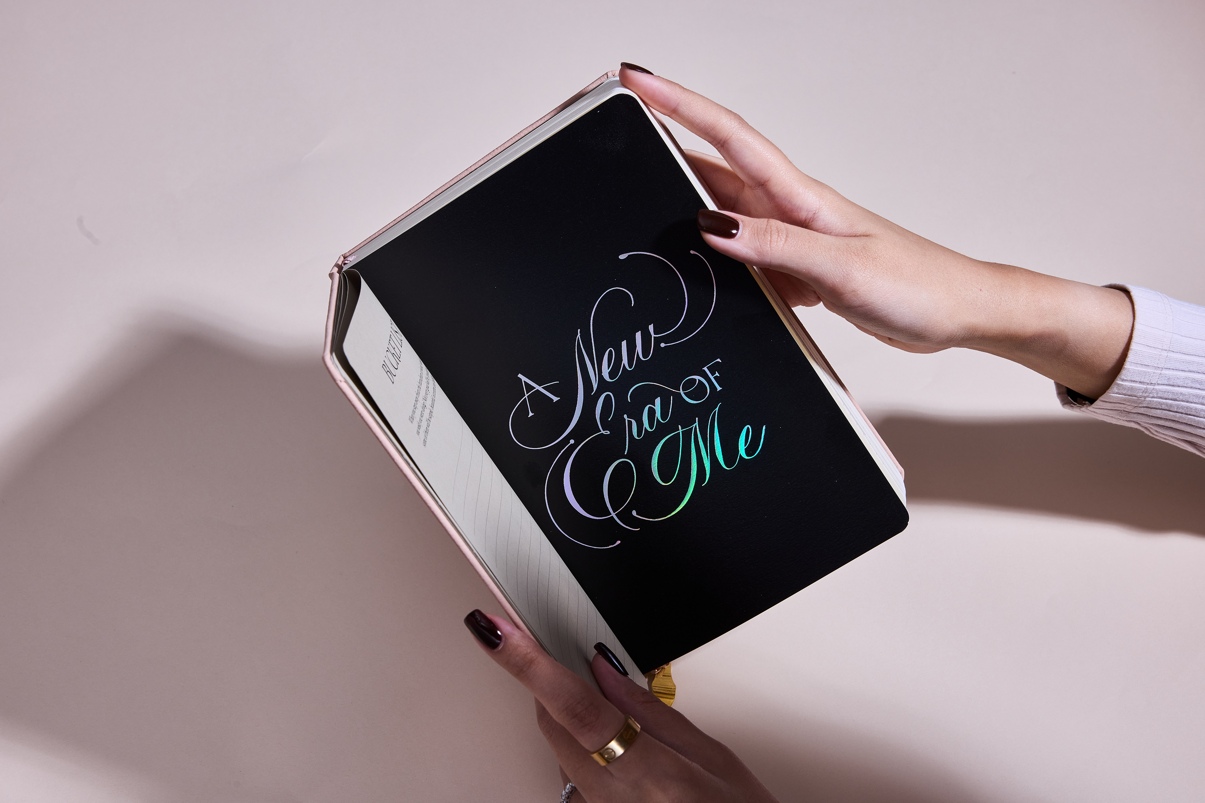
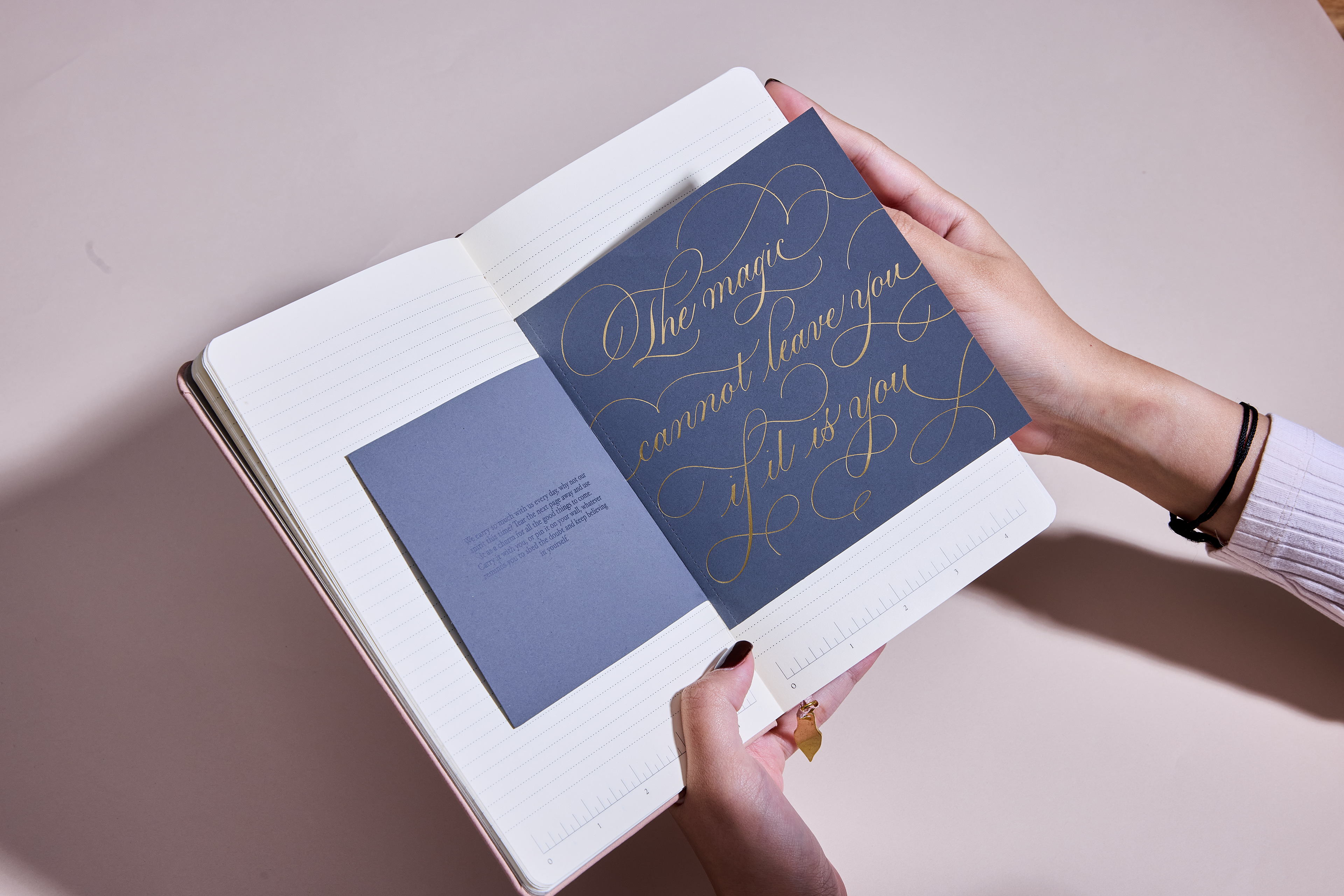
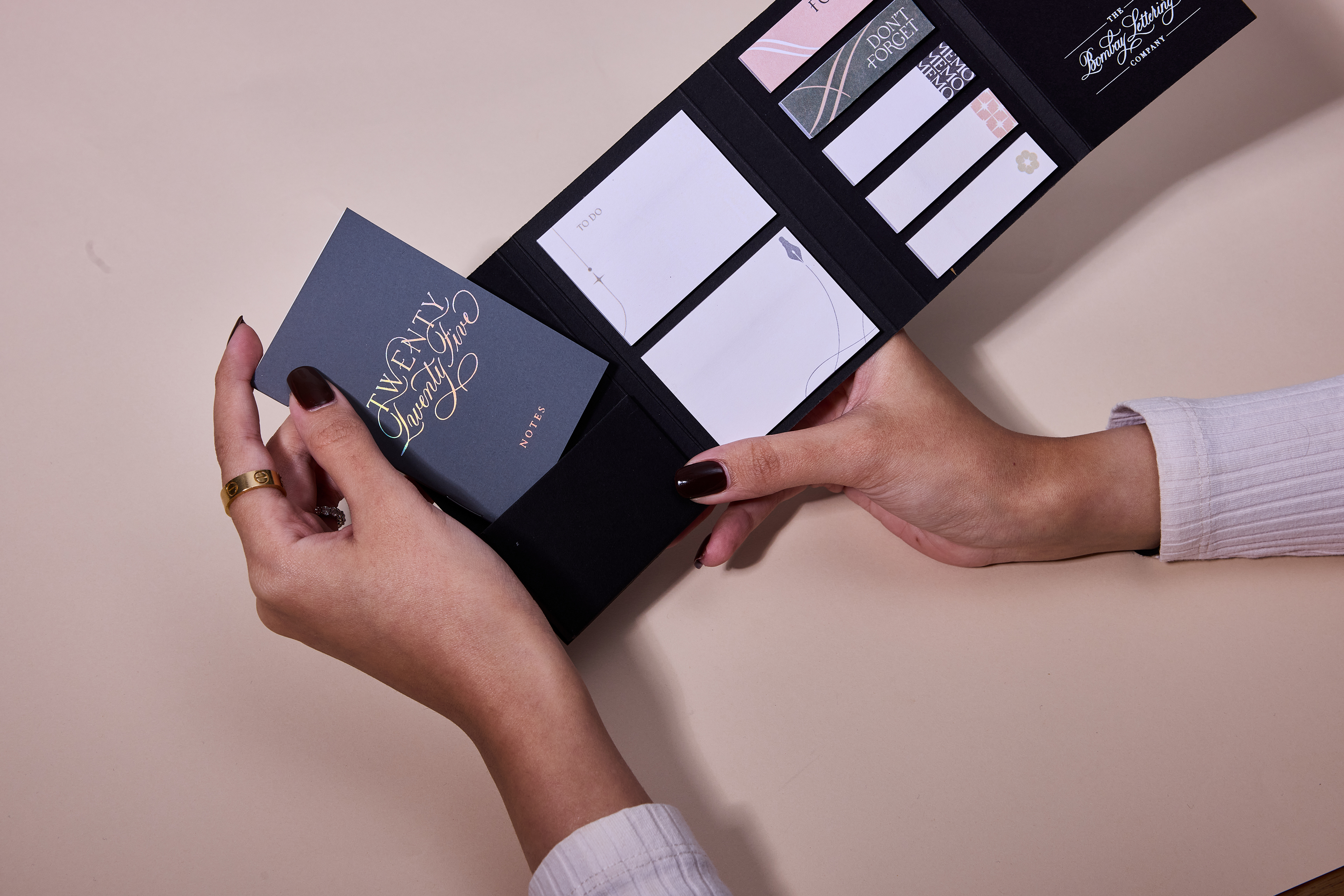
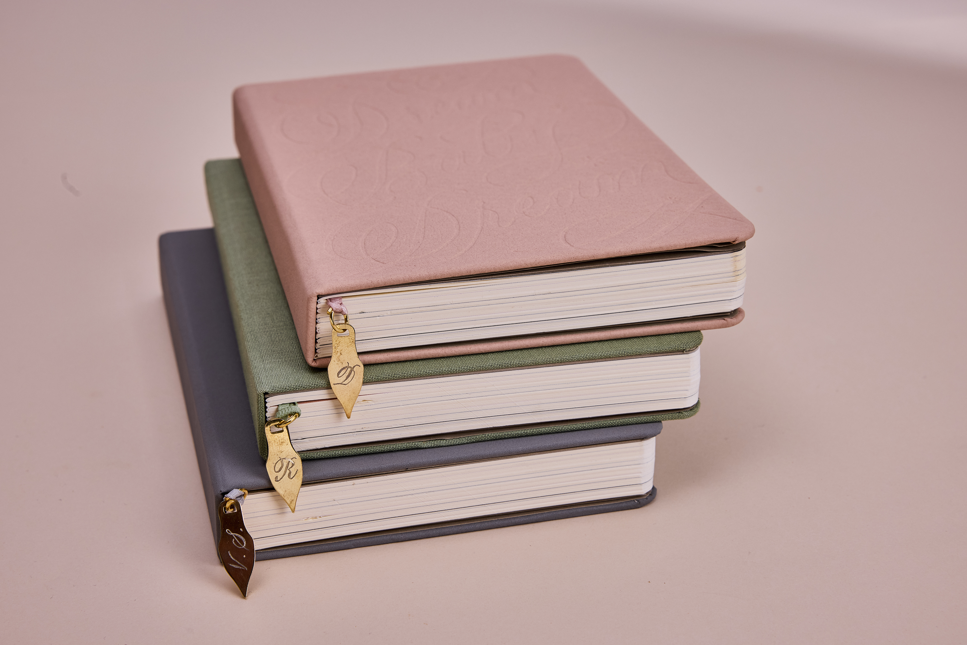
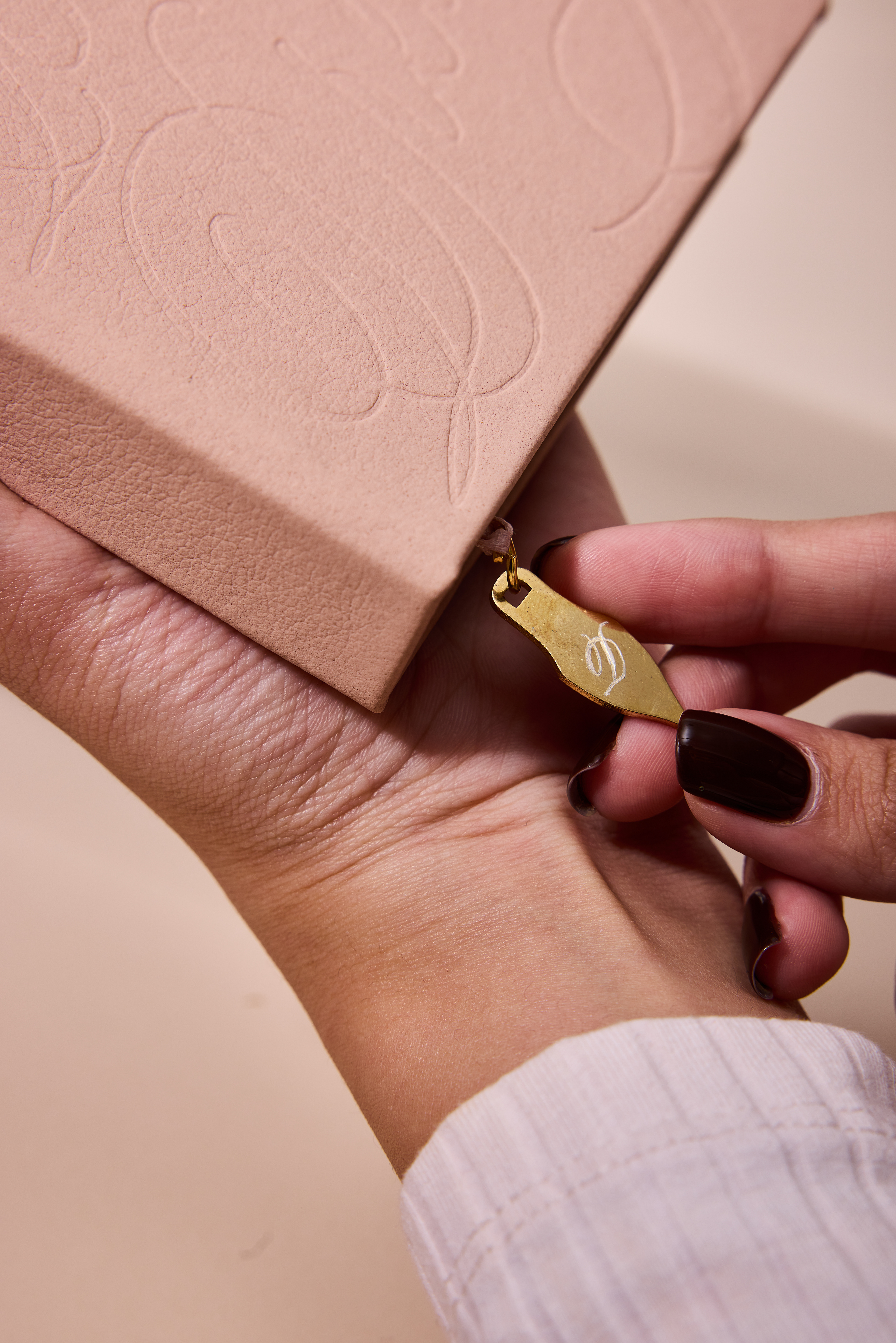
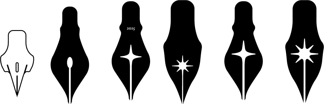
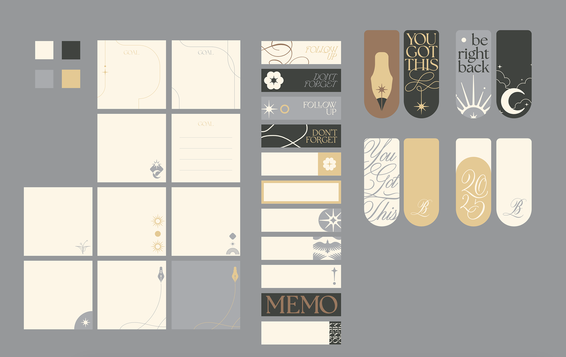
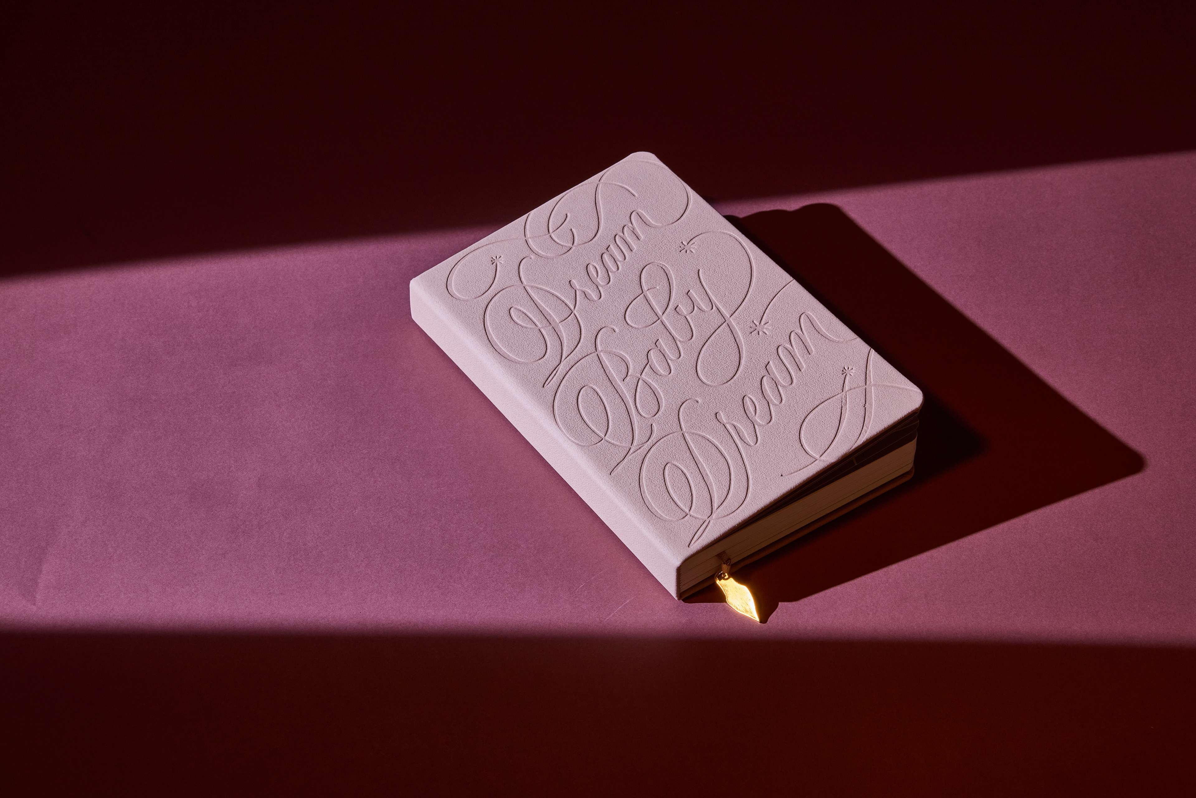
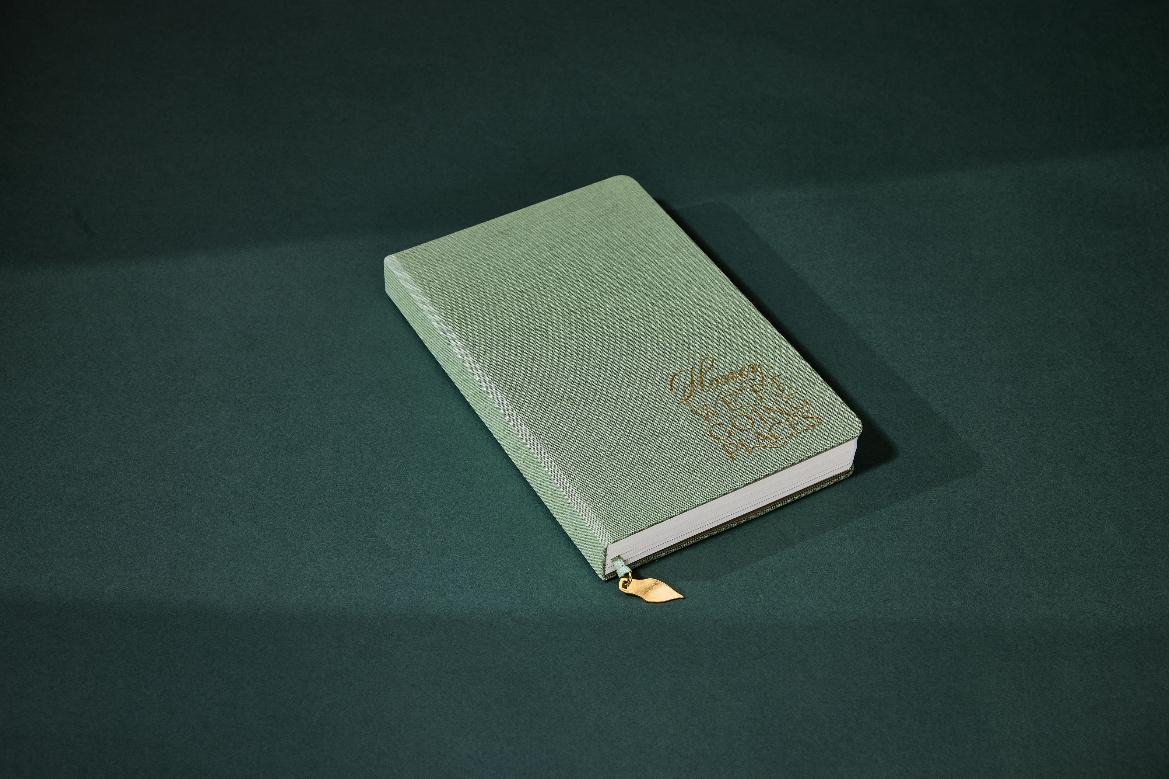
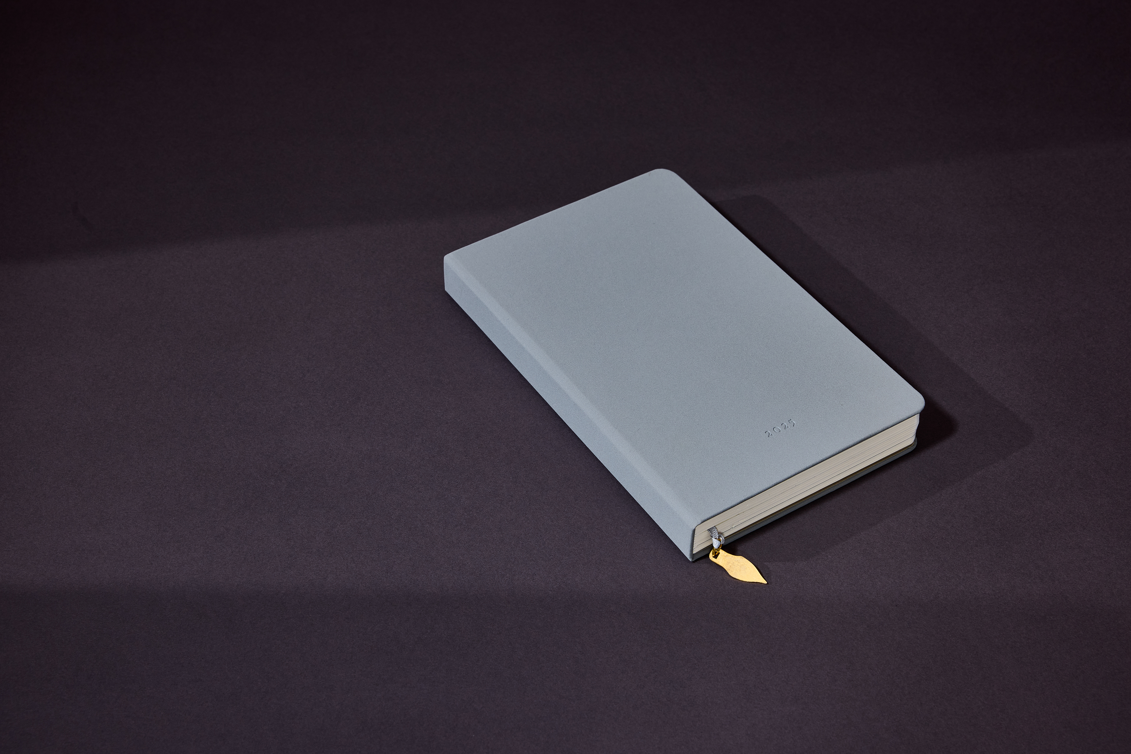
The studio started as a calligraphy service and has over time developed a following for spreading the love of hand lettering in India. As such, the symbol of the pointed pen nib became an obvious touch point for us to repeat at all key points, from key communications to a custom brass charm that is attached as a bookmark to each planner. These shapes are all based on nibs that are popular with the calligraphers in the studio, using their distinct shapes to create unique design elements.
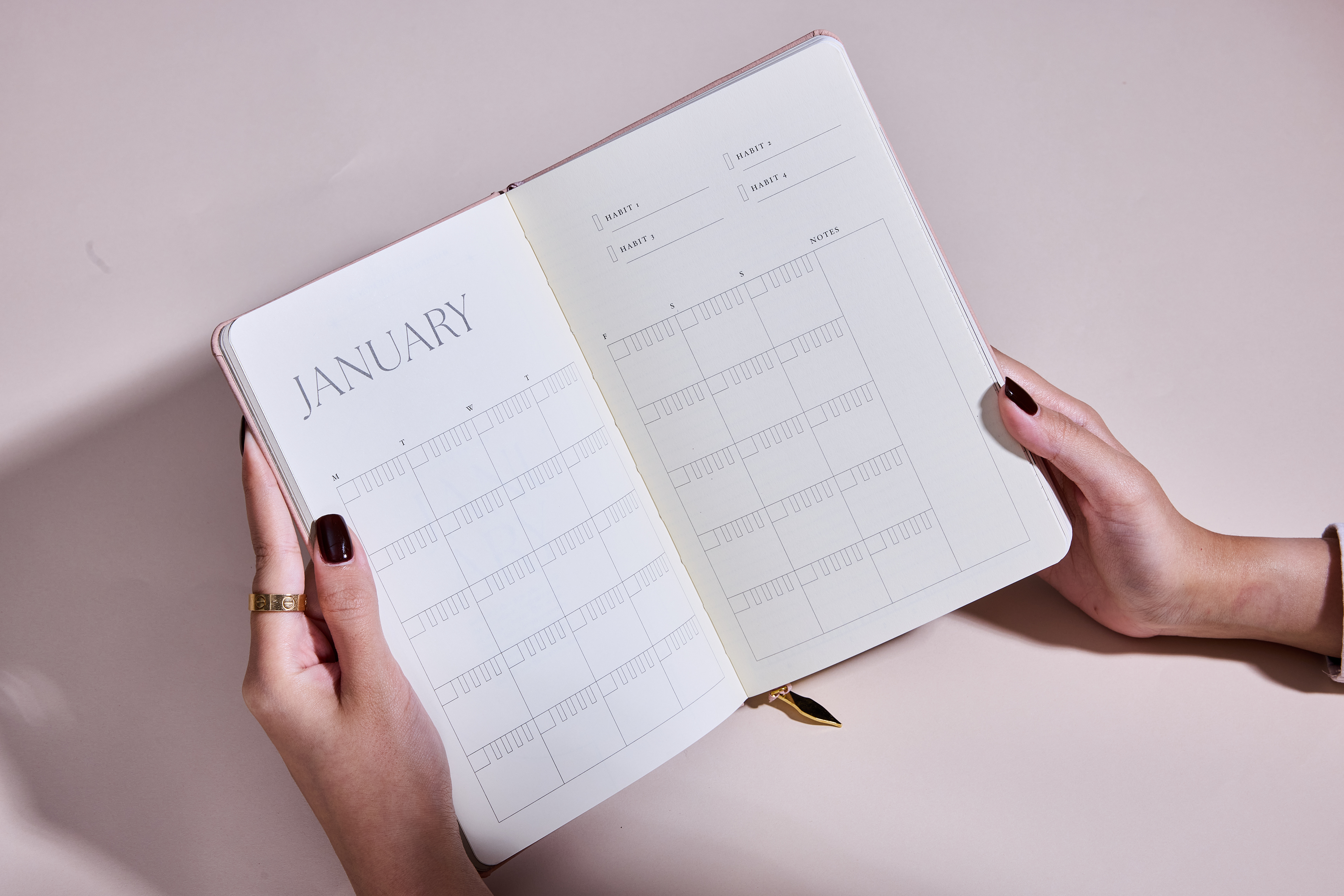
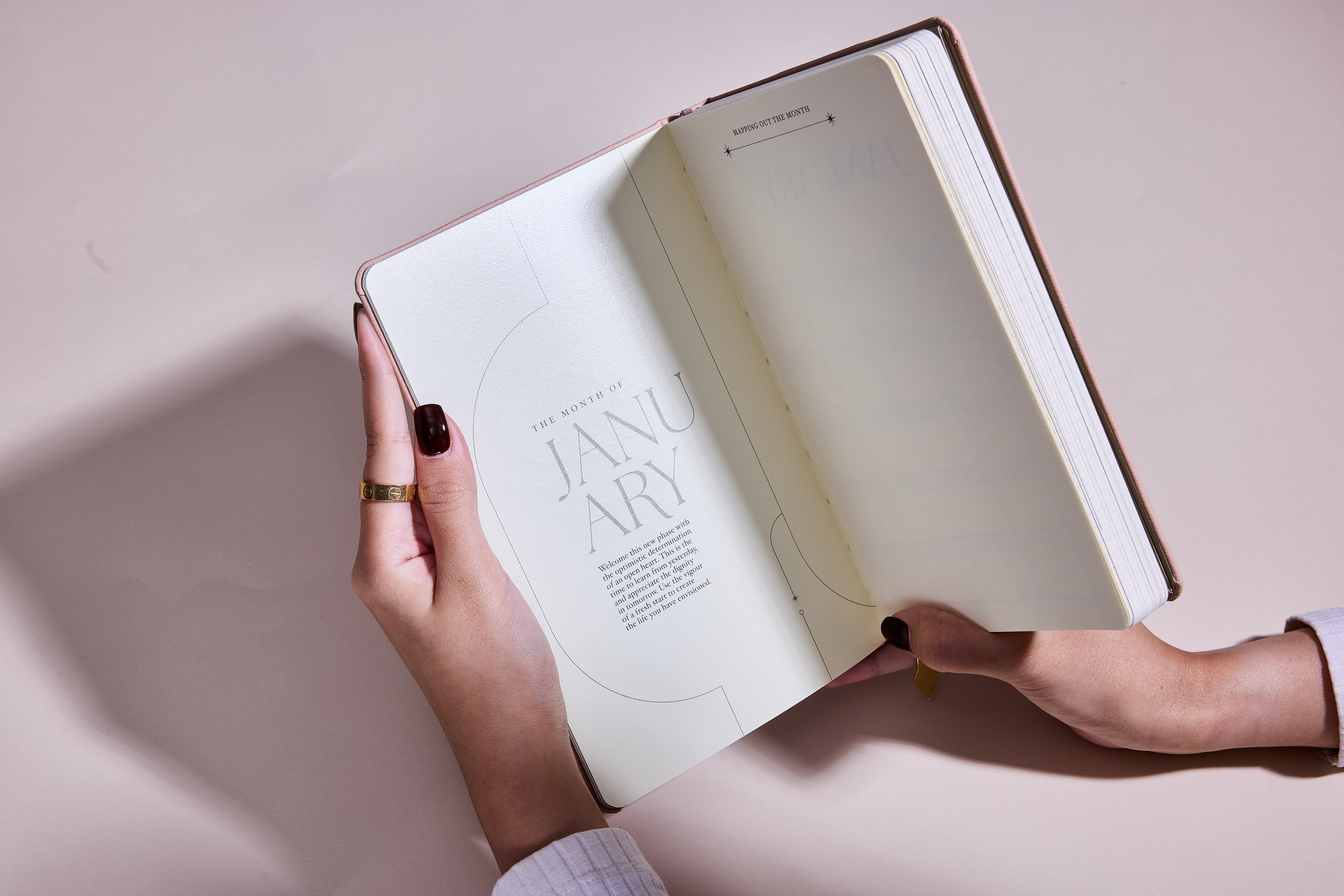
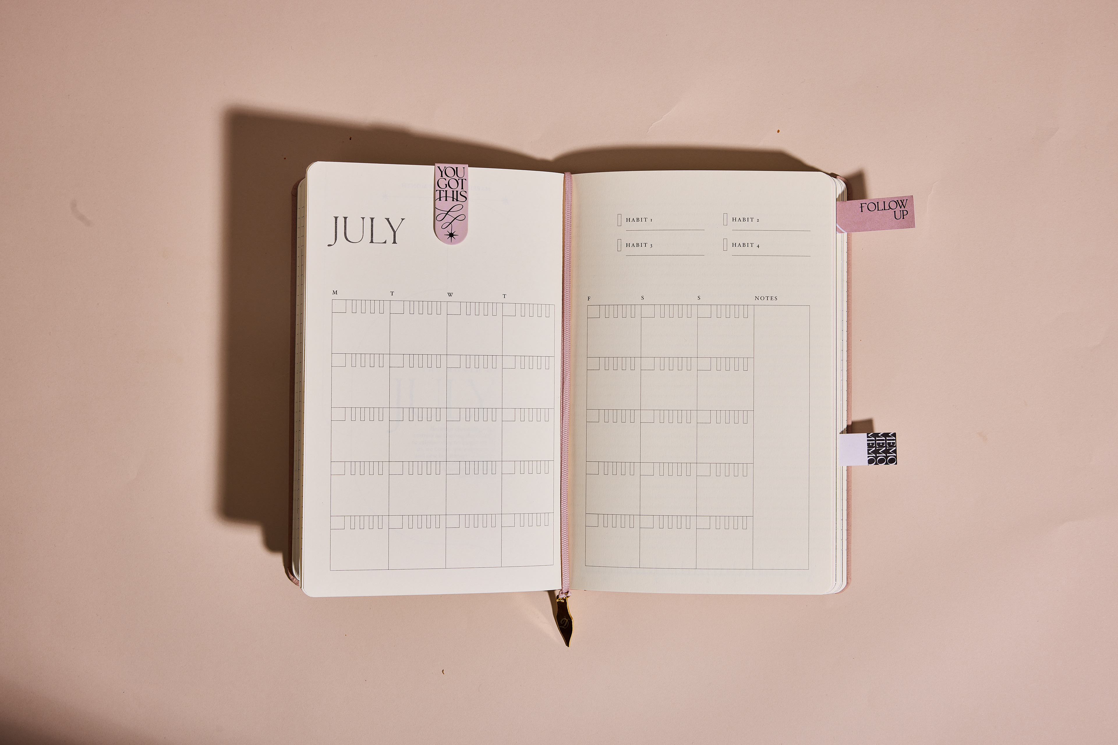
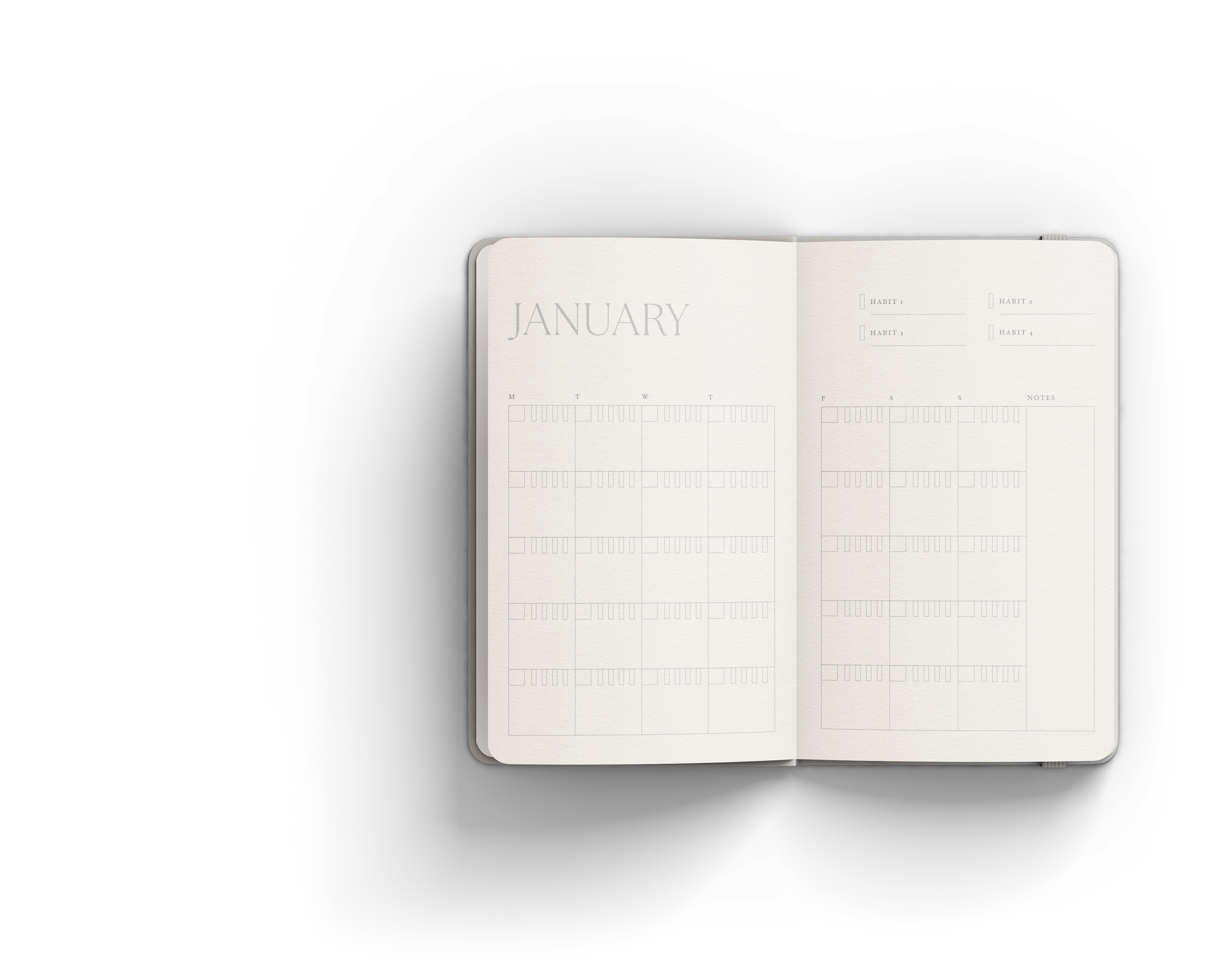
The design of the planner went from something more colorful and graphic to its final iteration as something minimal and pared back: we did some research into how to increase focus and keep people motivated throughout the year, and along with some polling of the audience for their preferences, we settled on the idea of a semi-dated planner that is divided by months, but not individual days so there's no pressure to use it every day.
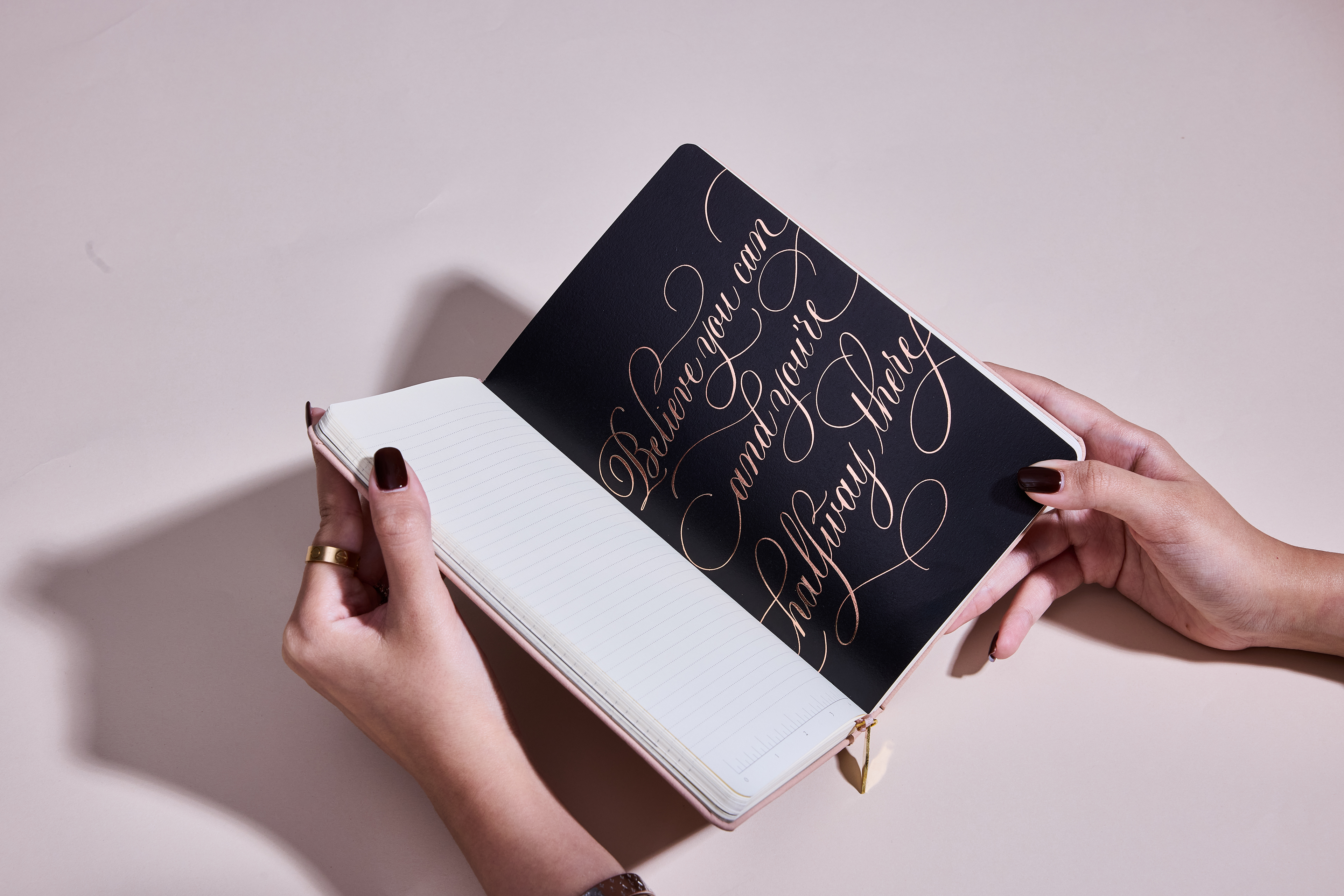
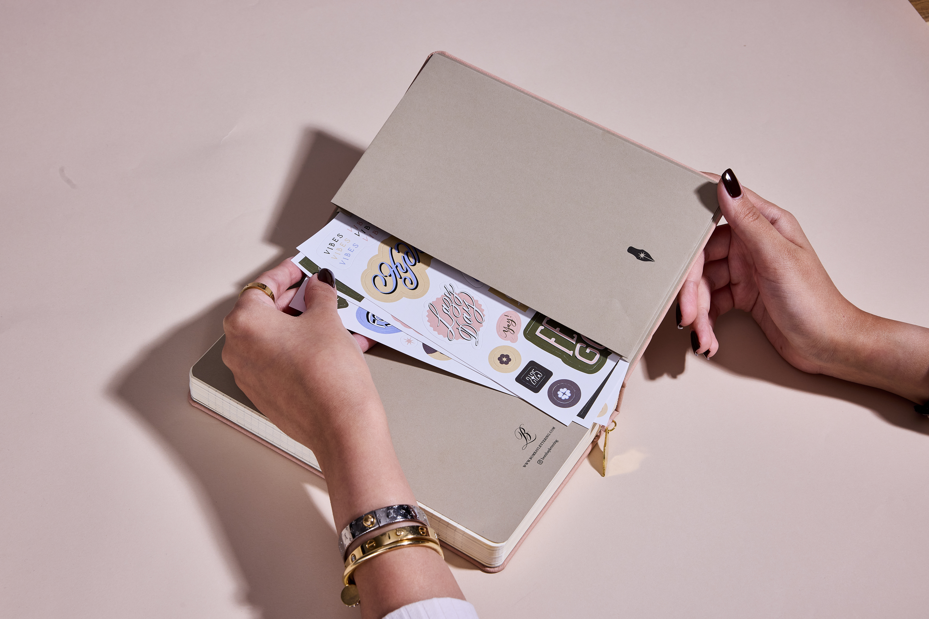
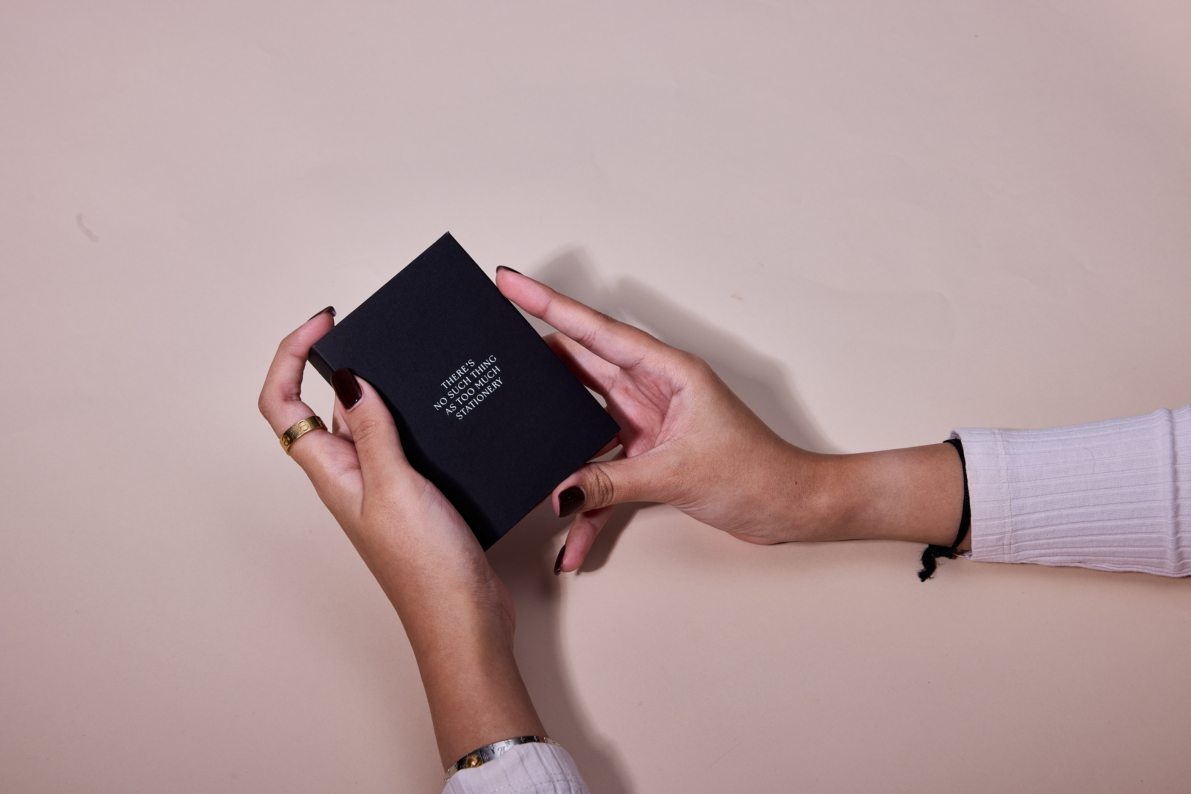
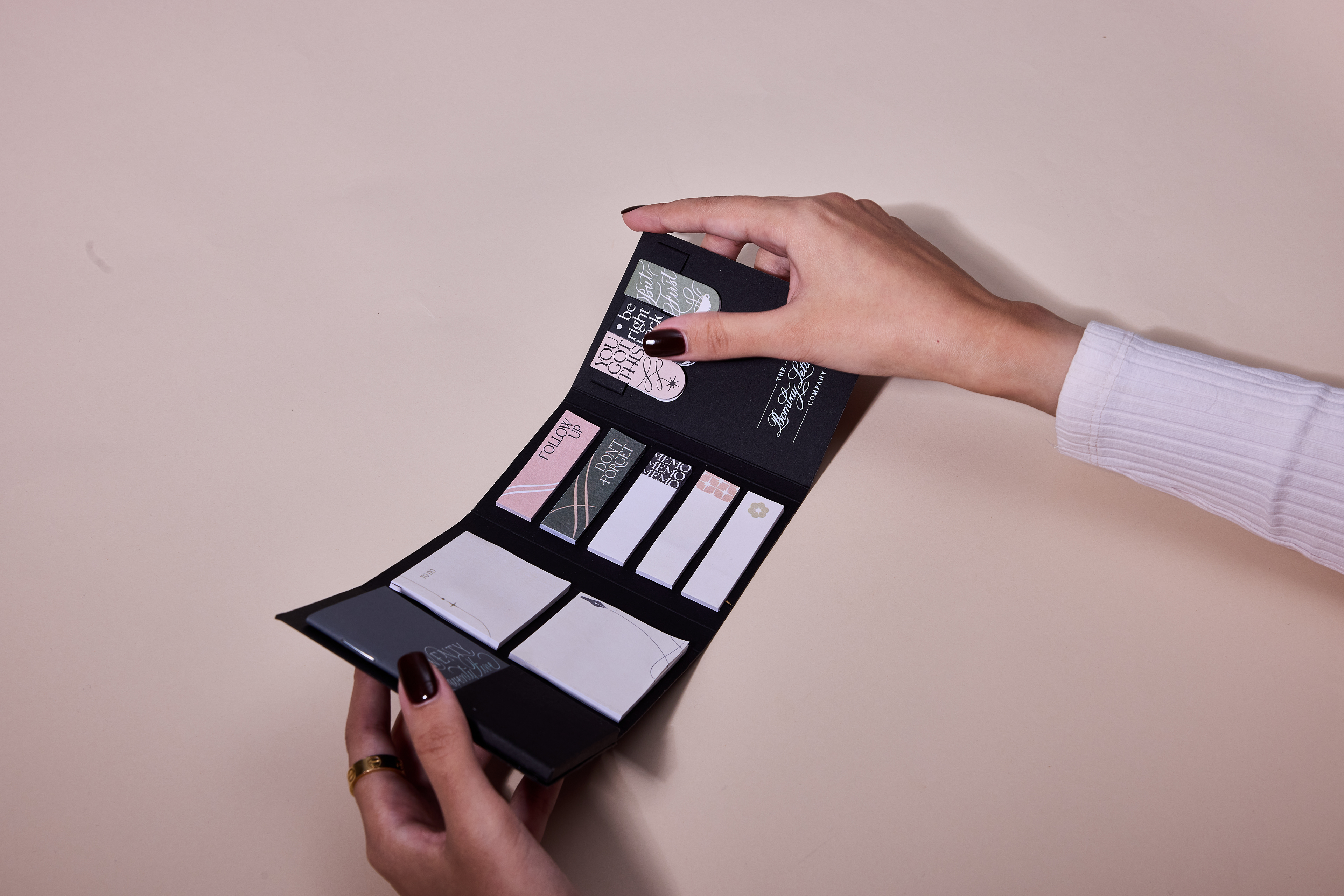
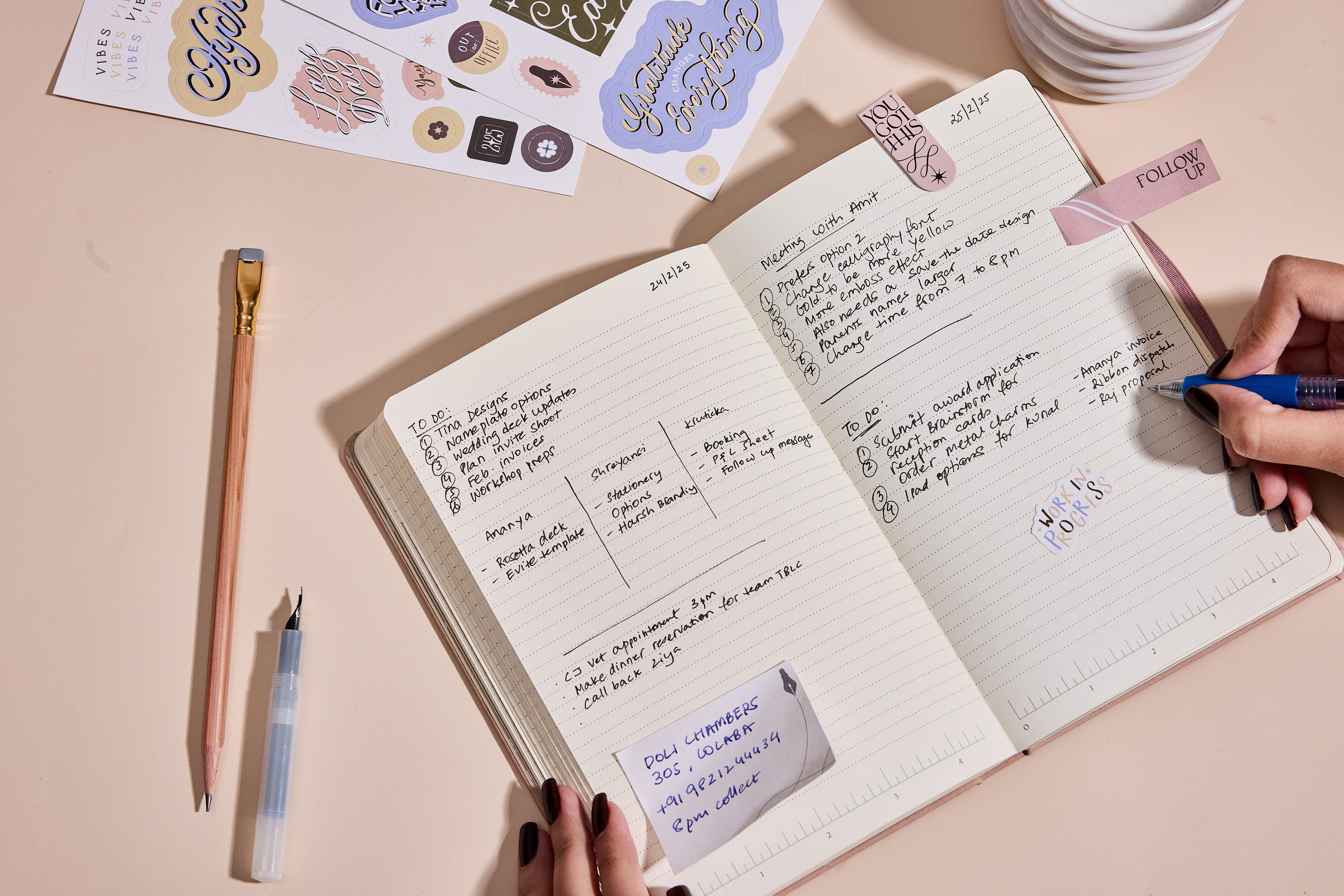
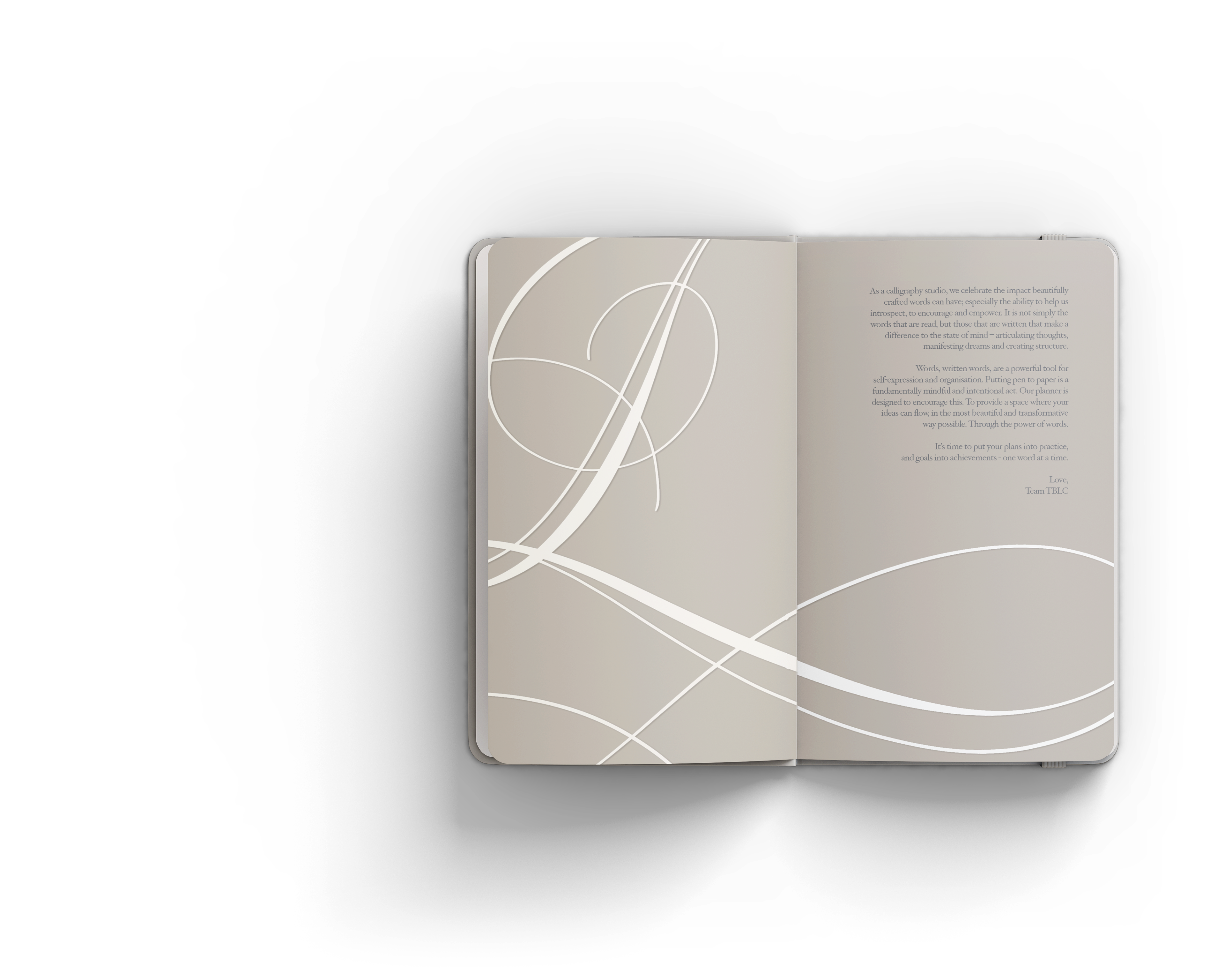
The planner is broken up with colorful pages of quotes, art and hidden surprises throughout the year, but functional pages are very minimal. There is a monthly spread that helps you track important habits and set dates, and a daily page with a dotted-lined design and a ruler at the bottom to assist with easily making tables and sections on a page as needed. The booklet of extra sticky notes, stickers and bookmarks that comes with the planner adds more color to the pages, but it's ultimately up to the individual to personalize the pages.

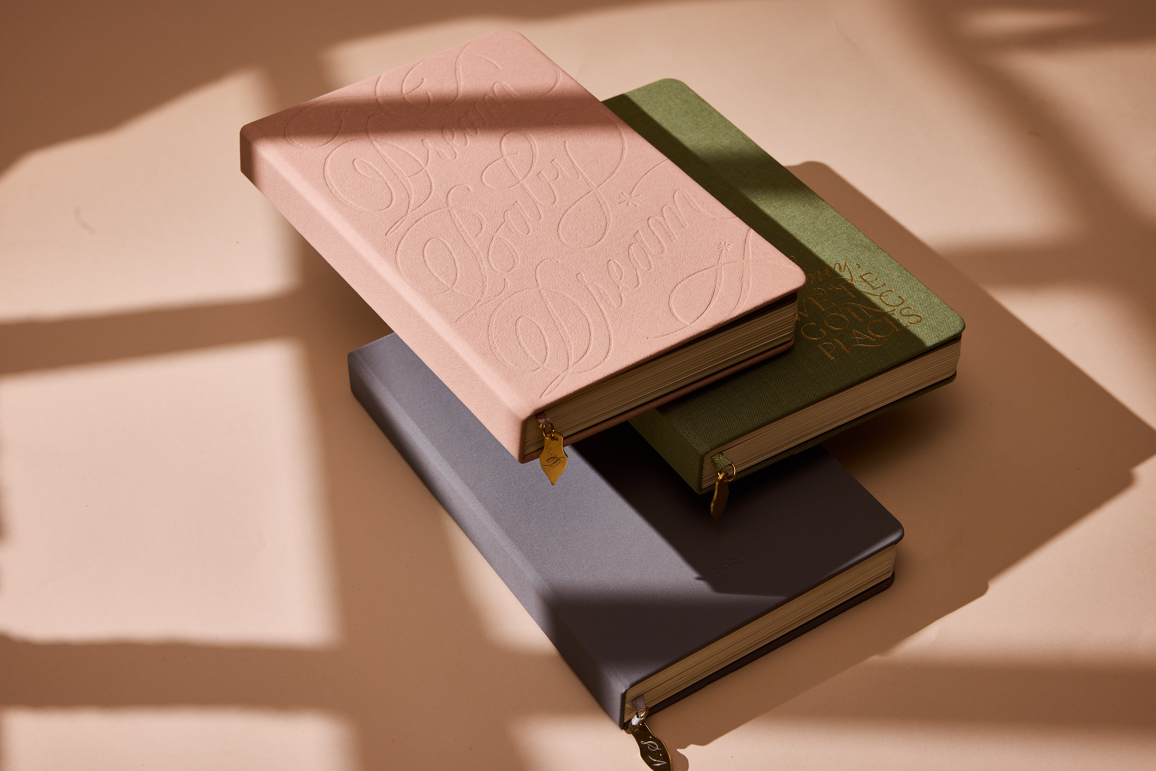
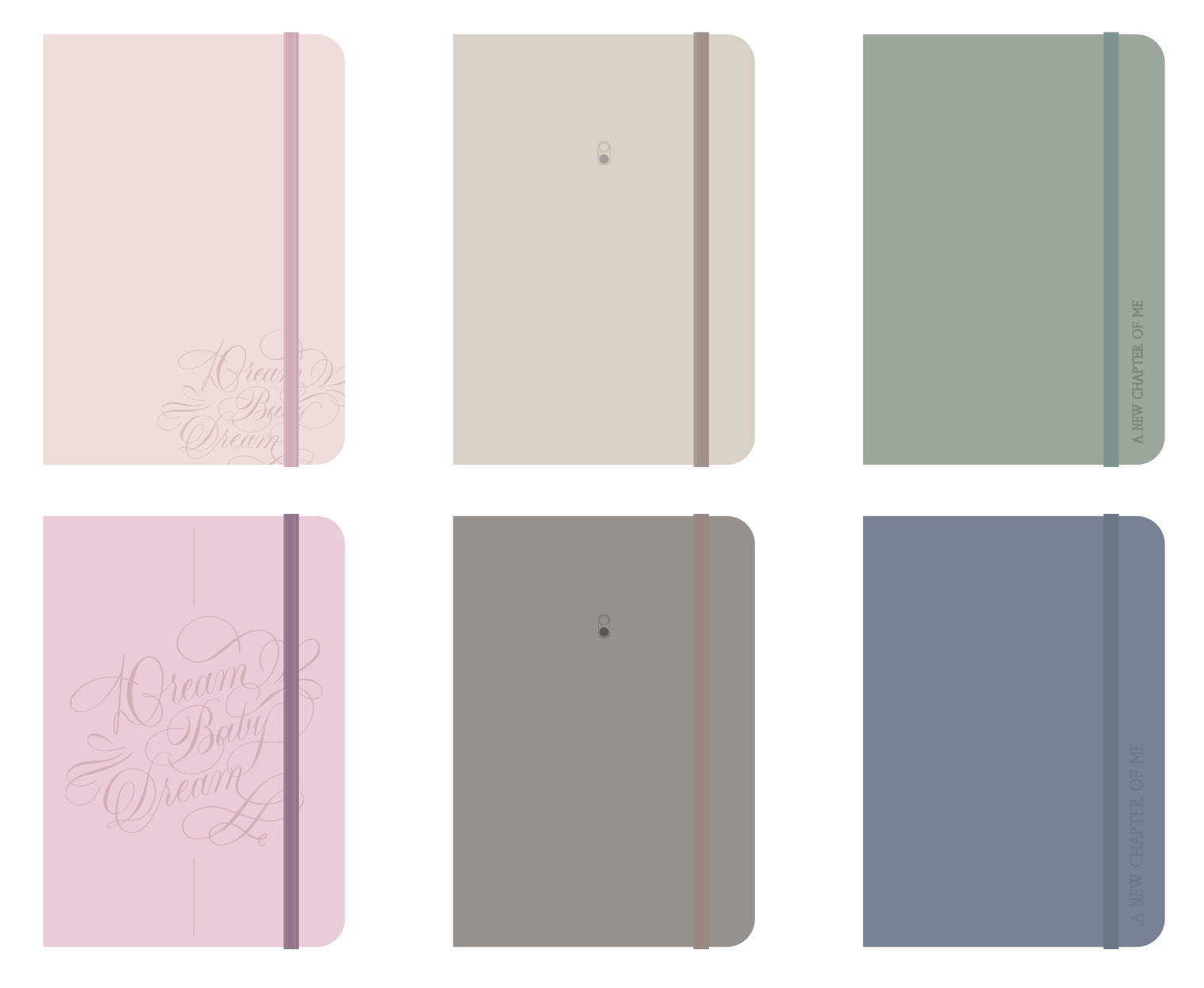
The colors and materials we chose for the covers also spoke to a range of preferences that were expressed: all materials had to be durable for daily use, and colors had to be meaningfully different from each other while looking cohesive when we presented them as one collection. We experimented with how to use color throughout the planner, going through a few iterations of our extras and cover options, eventually settling on a blush pink, sage green and mink grey.
Along with the design of the planner itself, I also designed the landing page that advertised the features, and oversaw the mood and execution of a photoshoot for the product, collaborating with a stylist and photographer.