ROLE: DESIGNER
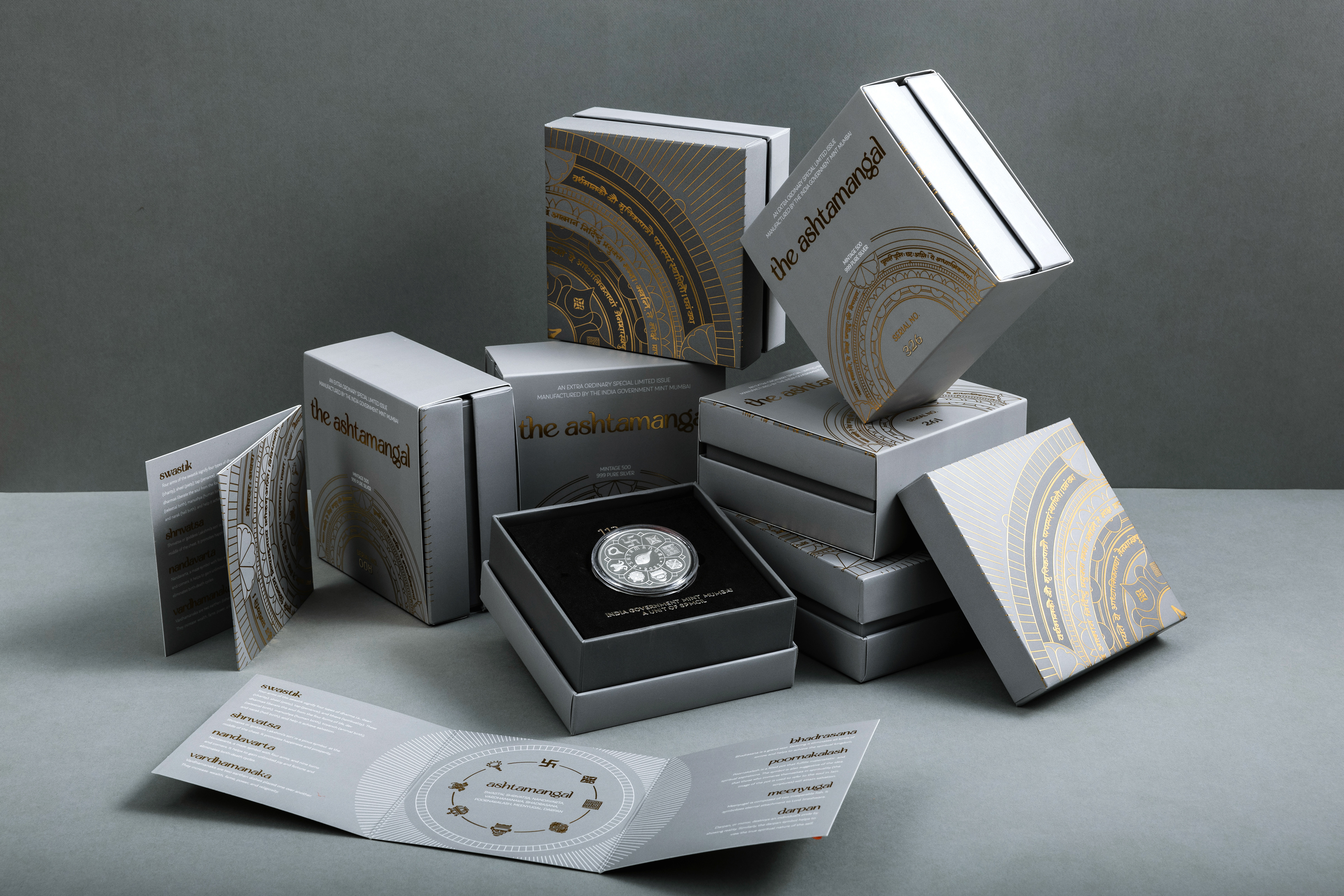
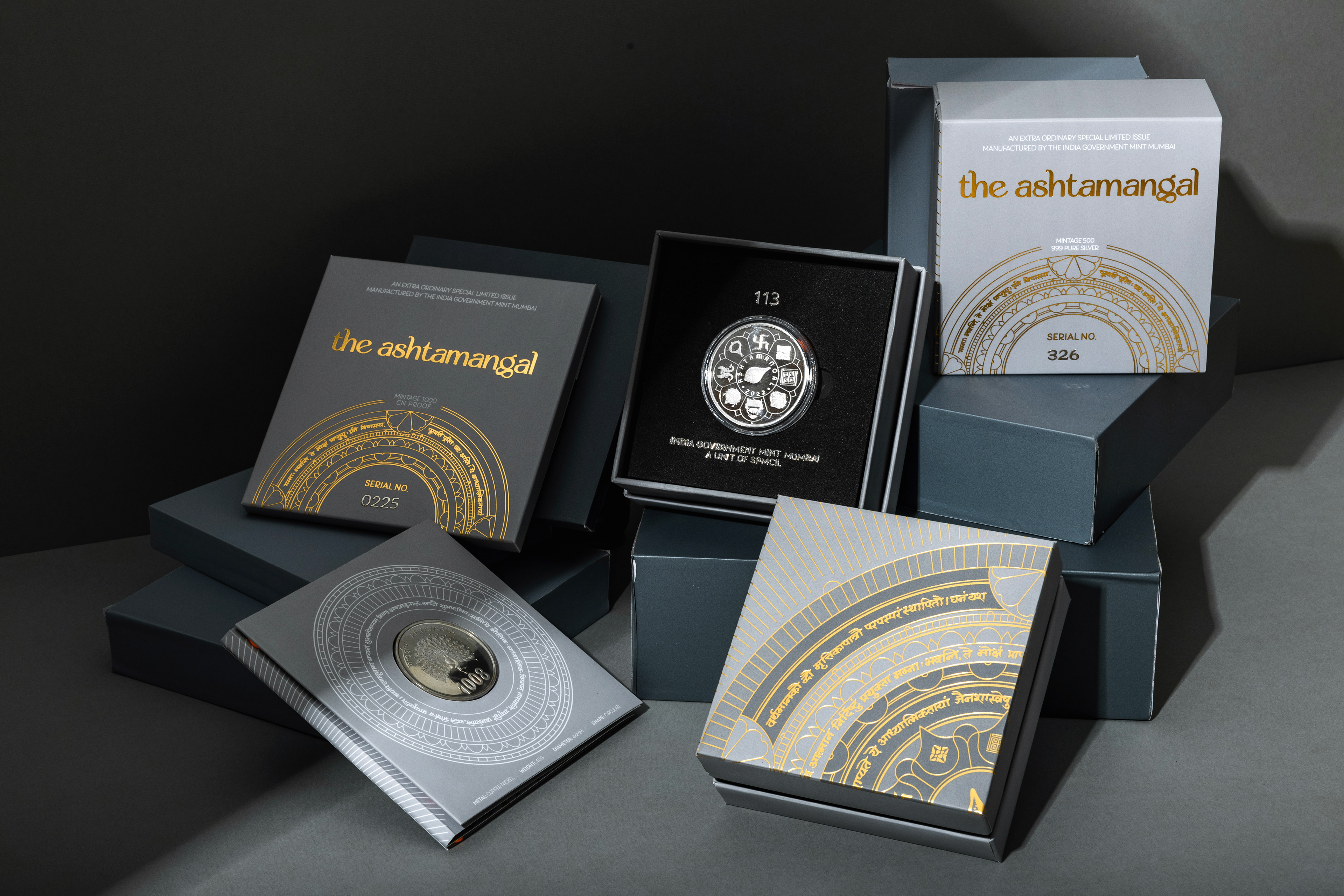
During my time at The Bombay Lettering Company, we were approached by the Mumbai mint to be the first external studio ever to create packaging for one of their limited edition collector's coins.
I was the principal designer on this project, in charge of everything from the artwork to managing print.
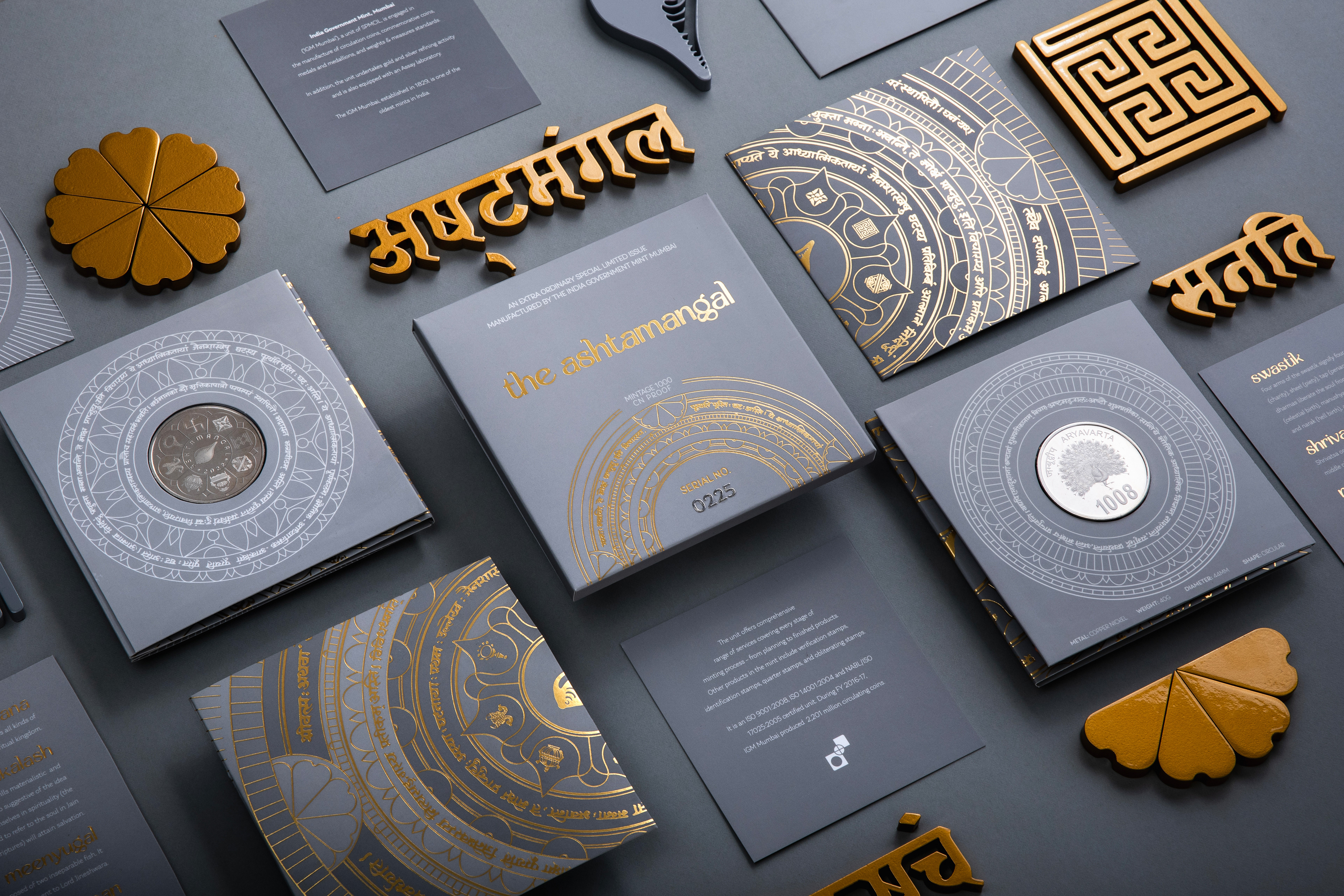
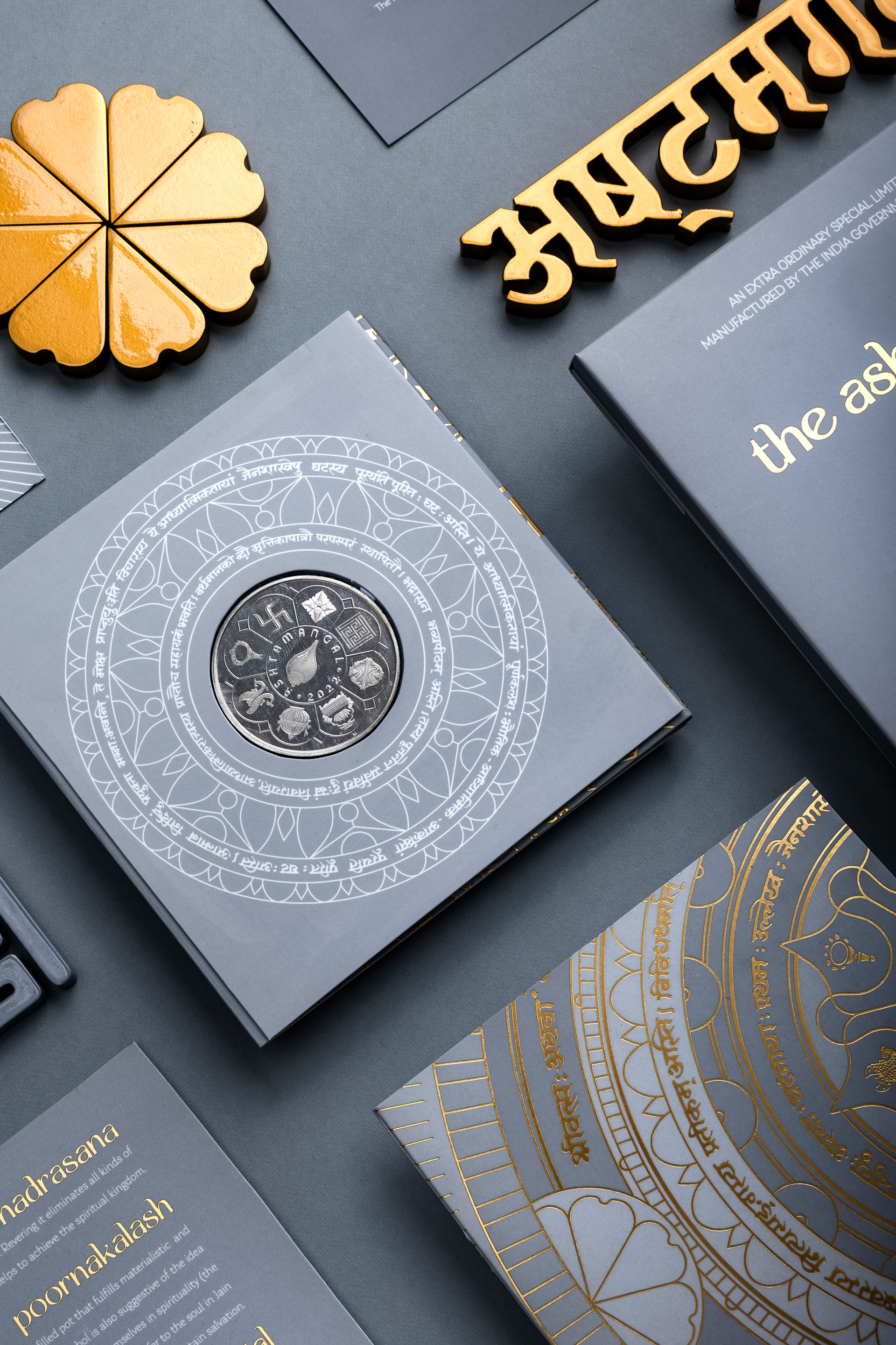
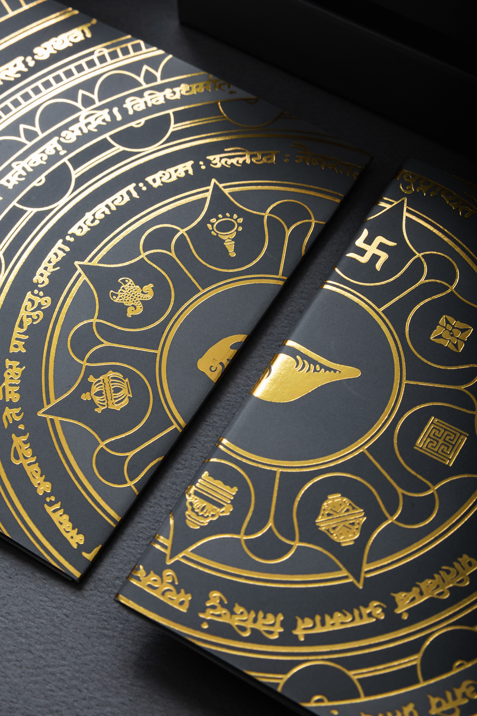
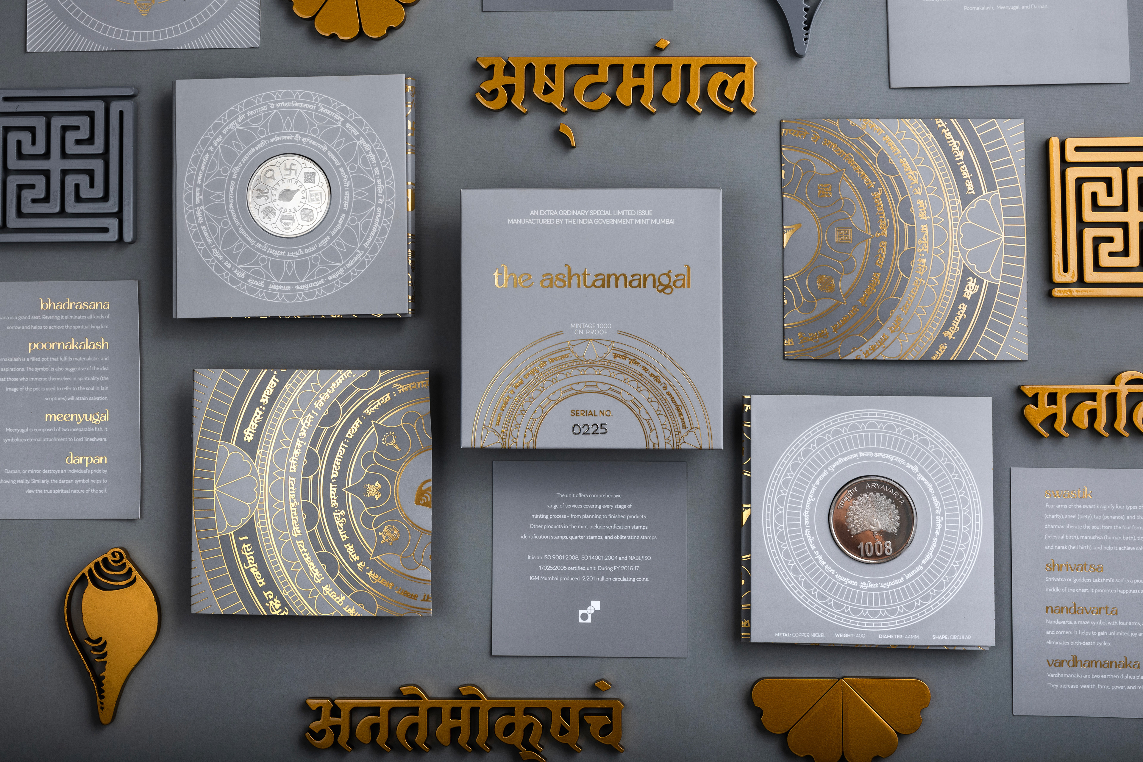
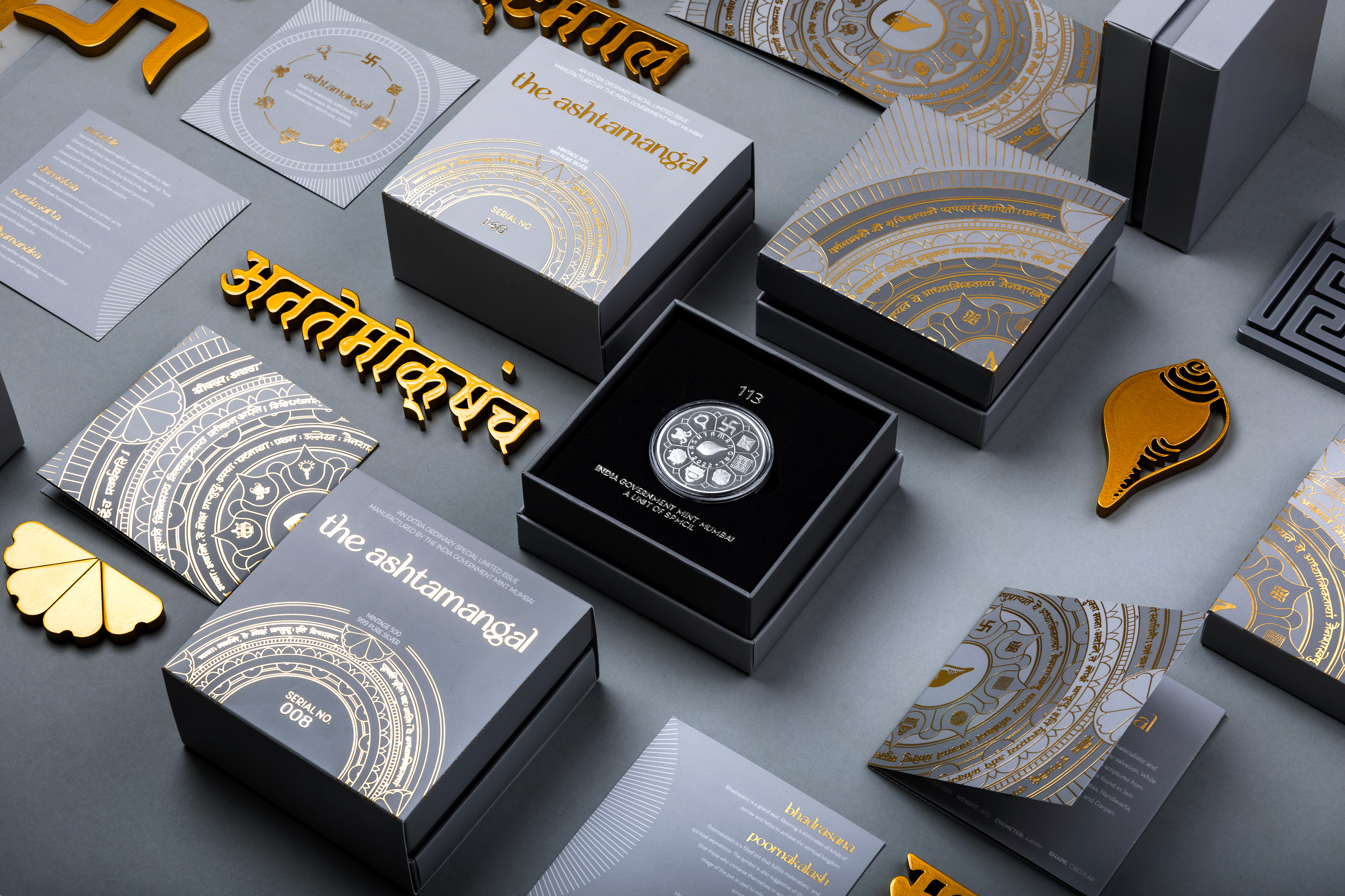
The Ashtamangal is a set of eight auspicious symbols that have meaning in many religious practices from the Indian subcontinent, majorly Hinduism, Buddhism and Jainism. Understanding this natural syncretism and researching how important these symbols were to various groups of people was an integral part of the design process. We took the eight symbols exactly as they appear on the coins for the packaging.
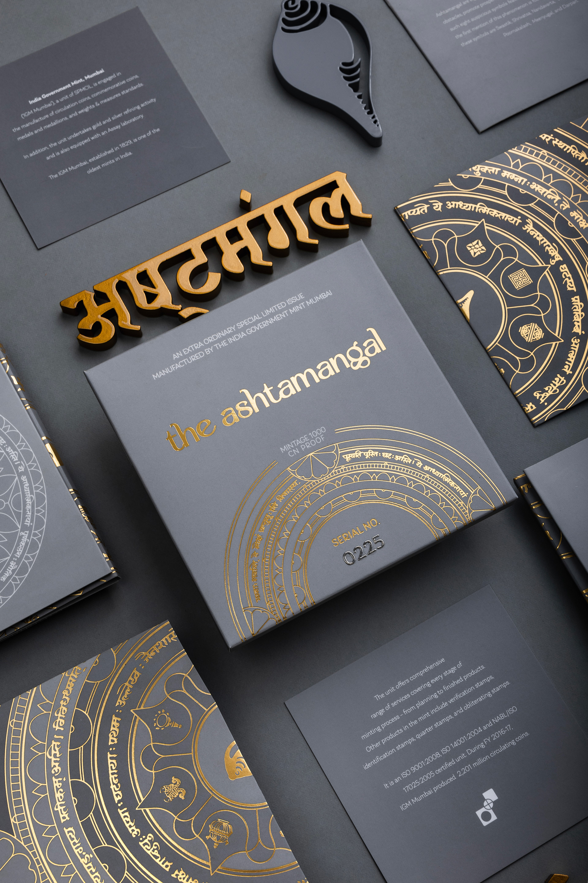
Since we knew the coins we were designing for would be silver (and possibly gold later), we were referencing a lot of luxury packaging using silver and gold in it. Since the packaging that is not meant to be discarded, it is an extension of the product and so we wanted to make sure that what we made added to the visual impact and value of the coins. We also wanted to make something that would look beautiful for a long time through various trend cycles, so our palette was kept very minimal with warm greys and accents of gold and silver.
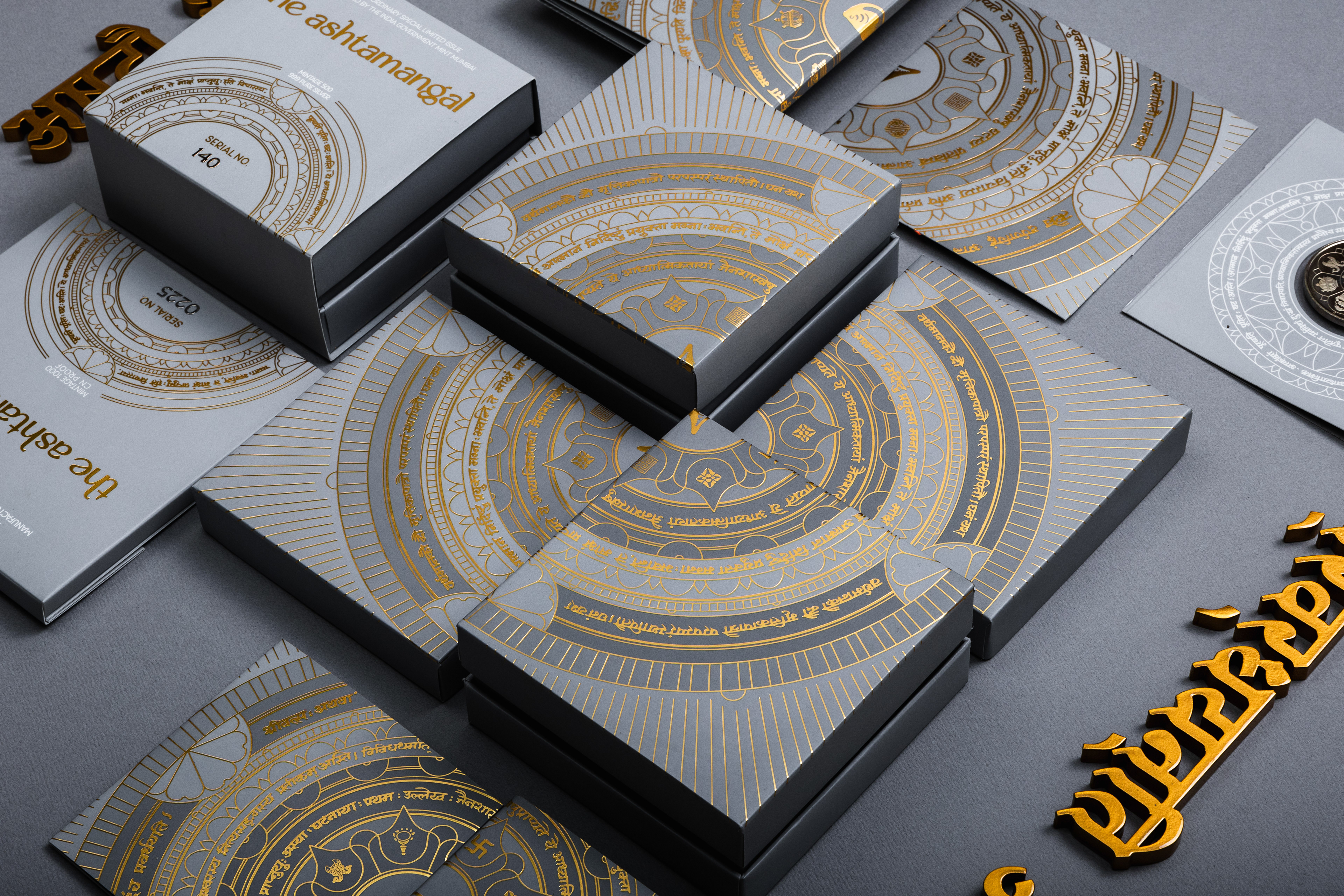
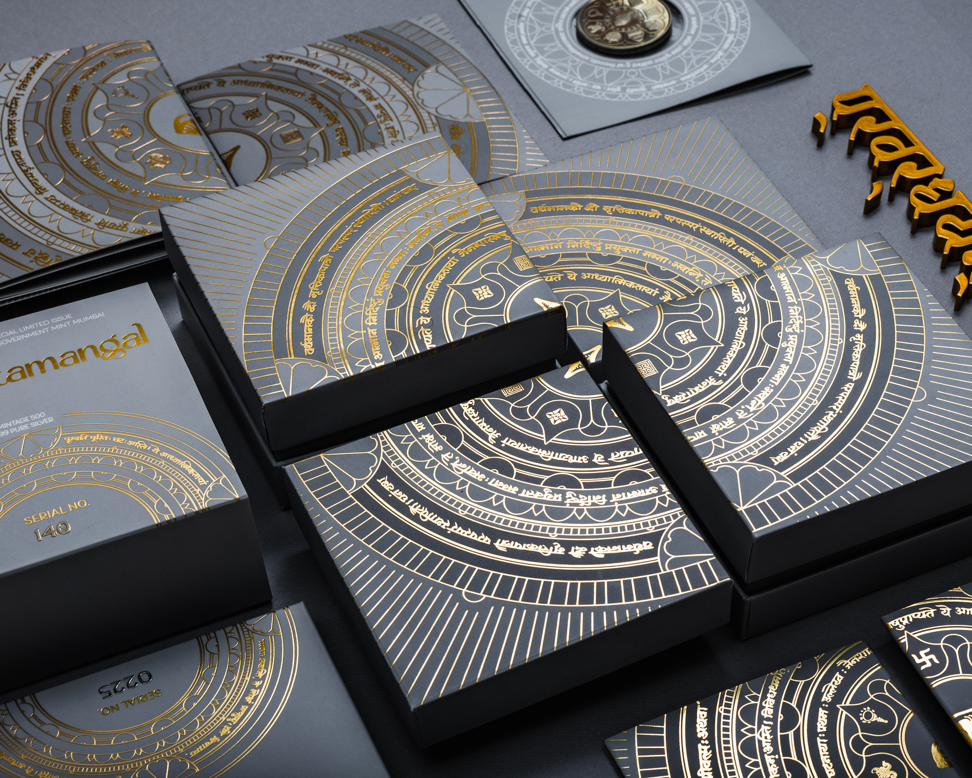
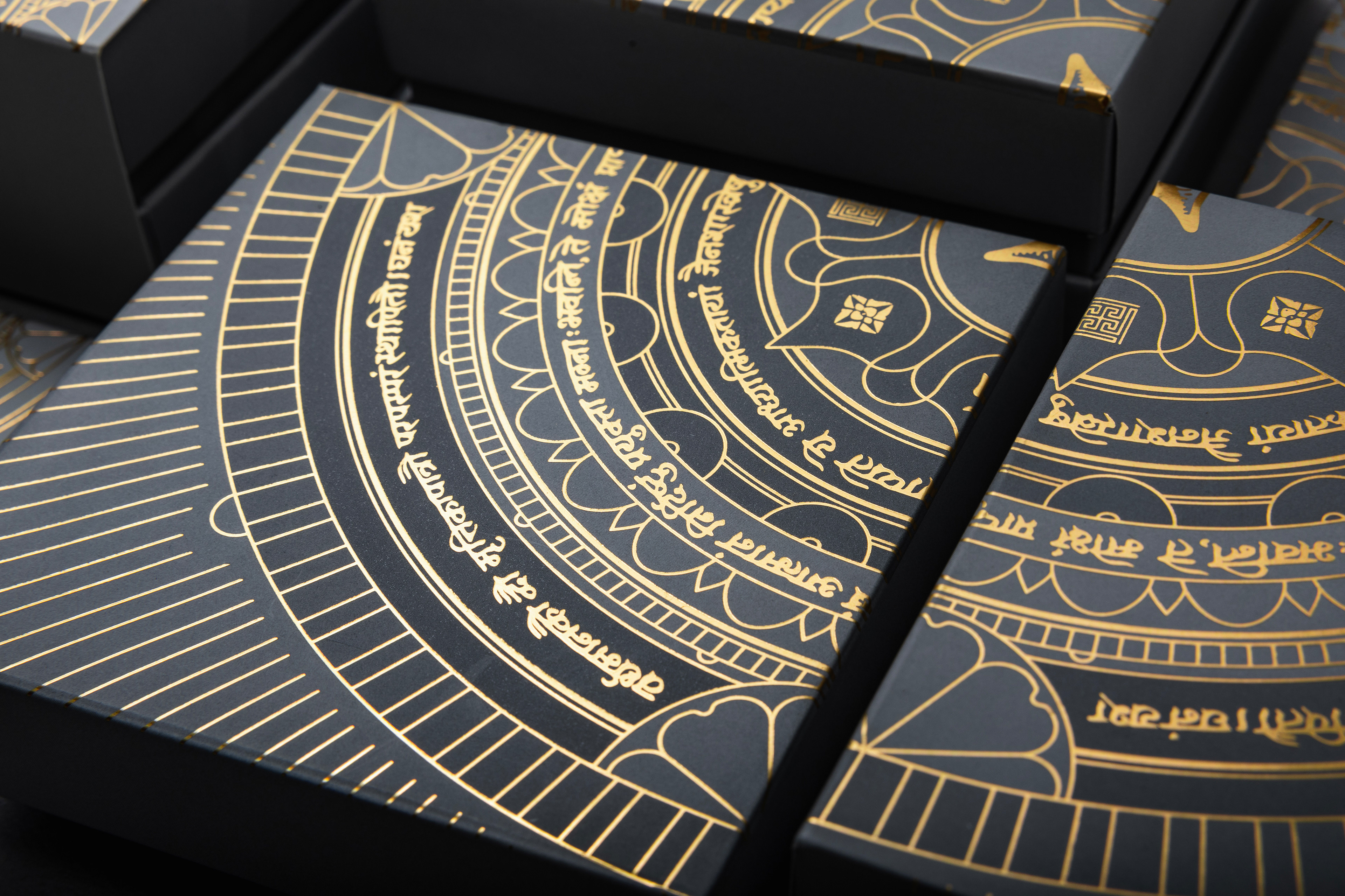
We wanted to combine influences from all kinds of religious and folk art from around the Indian subcontinent, to visually experiment with the range of traditions that these symbols and the principles they represent are important to. Another important part of it is the calligraphy, which we had hand-lettered by a master Devanagari calligrapher before experimenting with their placement (the text provided to us is an explanation of the importance of each symbol). We took inspiration from decorative/border/graphic floral elements in disciplines such as Buddhist mandalas and Pattachitra paintings that present religious lore.
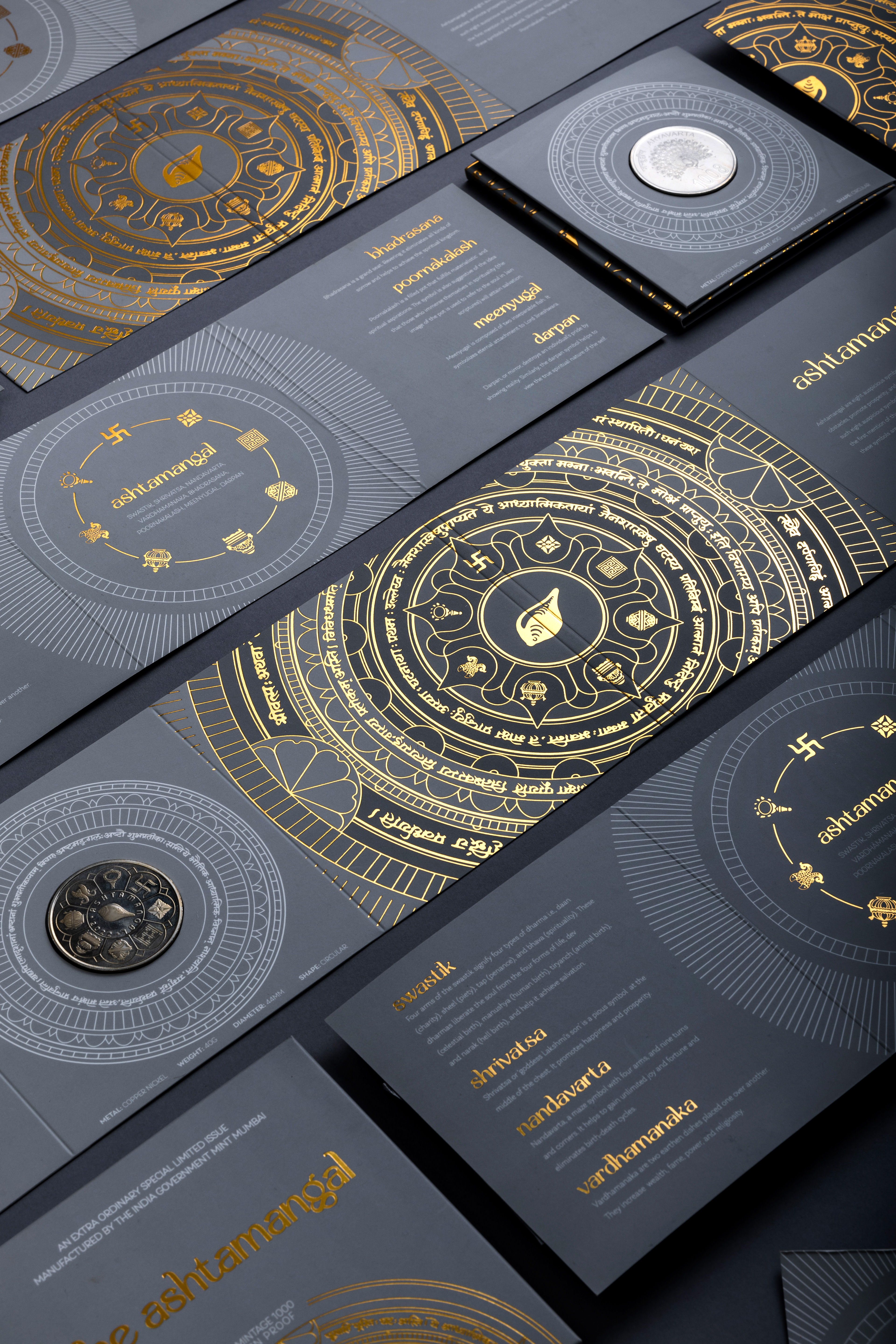
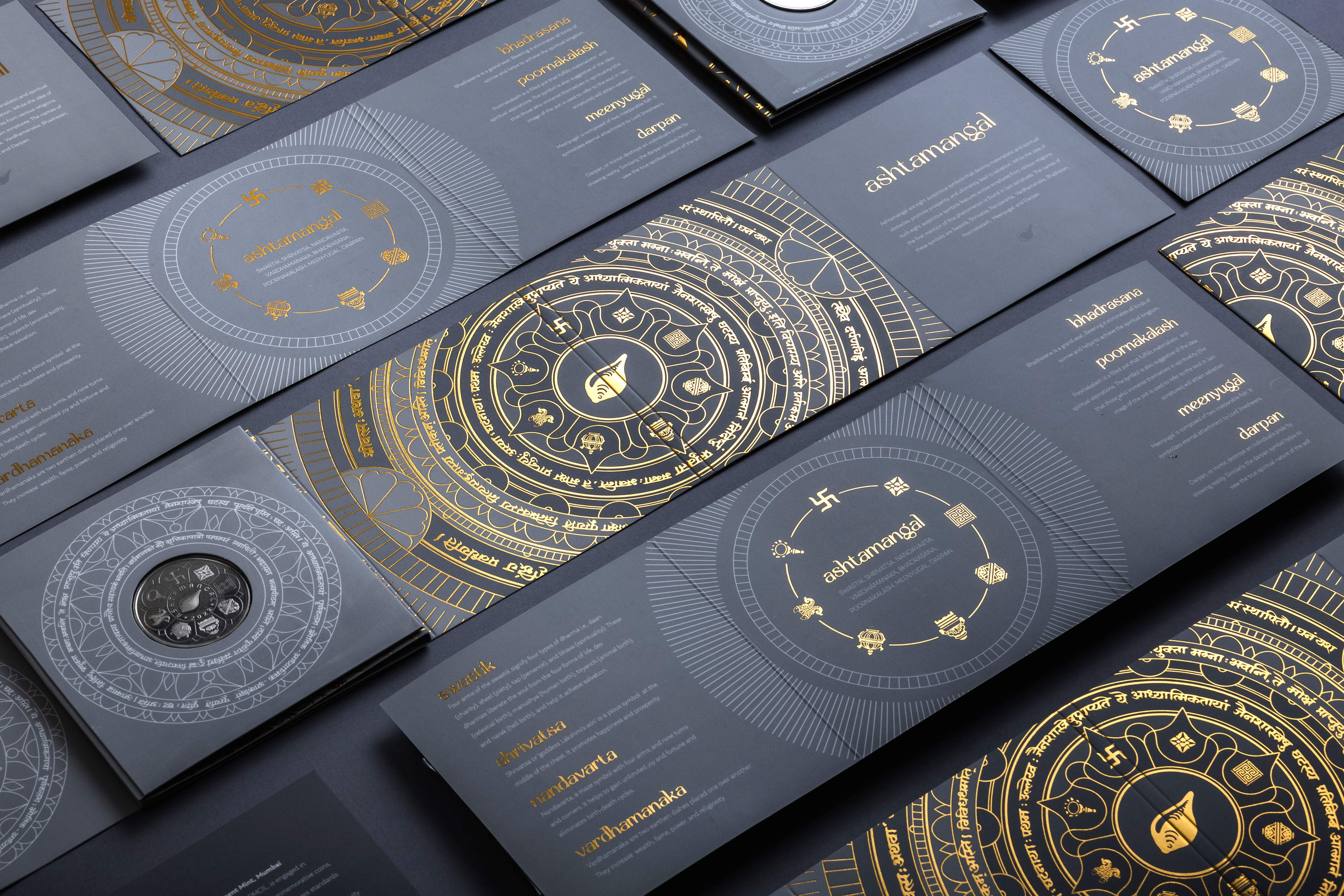
The whole mandala design is never seen in a single instance anywhere, it is divided over various faces of the product so that the person can put it together as they interact with the packaging.
This also allows a viewer to take in each individual symbol and allows them to appreciate the calligraphy, which is created with subtle flourishes.
This artwork was expanded on for supplementary artwork that the coin sat in within the packaging, extra art for envelopes/sleeves etc. These contain extra literature about the symbols and some more border/decorative shapes.
