ROLE: DESIGNER, ILLUSTRATOR
I was hired to help refresh the logo of a nonprofit organization that worked during the pandemic to provide daily necessities to the immigrant population of Savannah, GA.
The goal was to make the logo more friendly and approachable, but keep everything else about established branding in tact as the design language intentionally caters to visual impairments/several types of colourblindness. We experimented with symbols that would be meaningful to the ethos of the organisation.
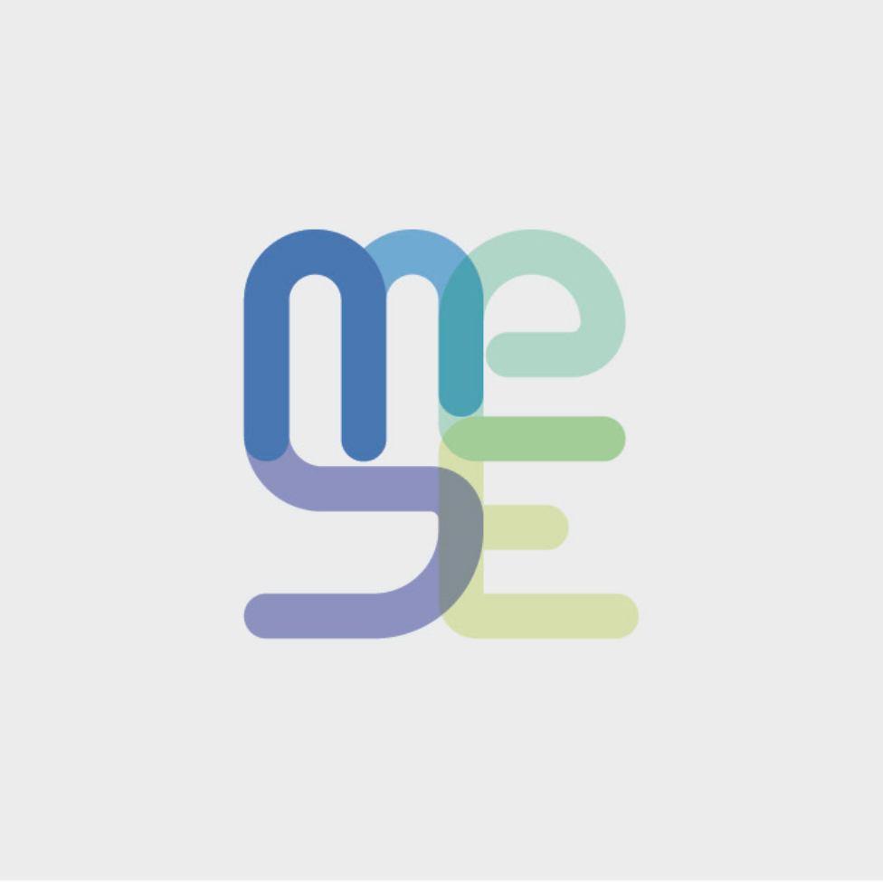
In the end, the logo that was chosen was a little more abstract: drawing from the original logo that used the symbol of a hand, and we wanted to keep the symbol of the 'helping hand', which would be familiar to the people interacting with it on a daily basis. This is a much more abstract version of it of course, but the forms echo the previous one. the rounded edges and contrasting colours bring the heavier old logo easier to translate to more mediums and sizes while still being legible. In the end, we kept the old brand colours to make sure the recognition was high, and because these high contrast colours are always legible for the visually impaired. Along with the MESE logomark (which is the most frequently used version as it is the name that is most recognised by the audience), we also made a full-name version for use on merchandise etc.
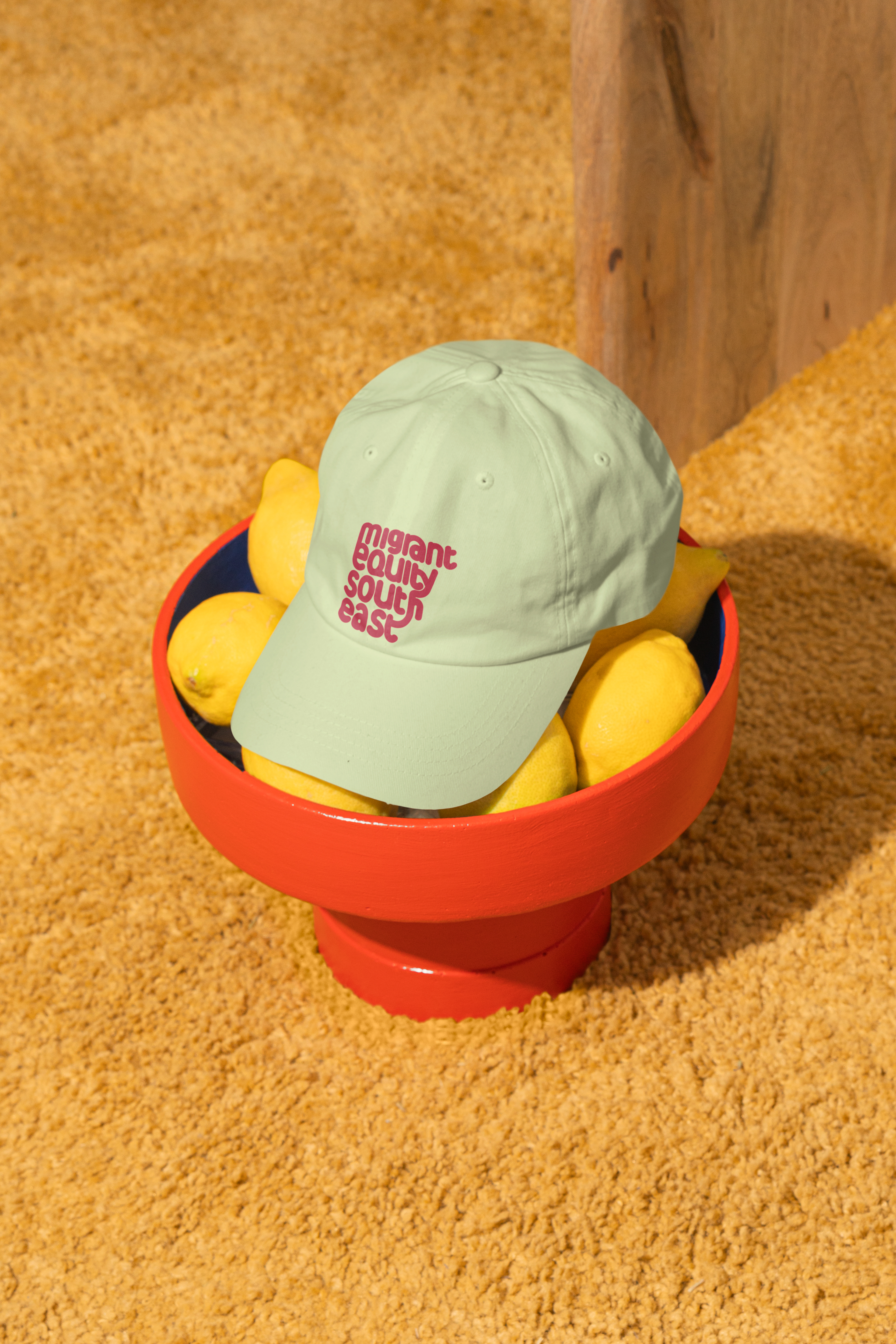
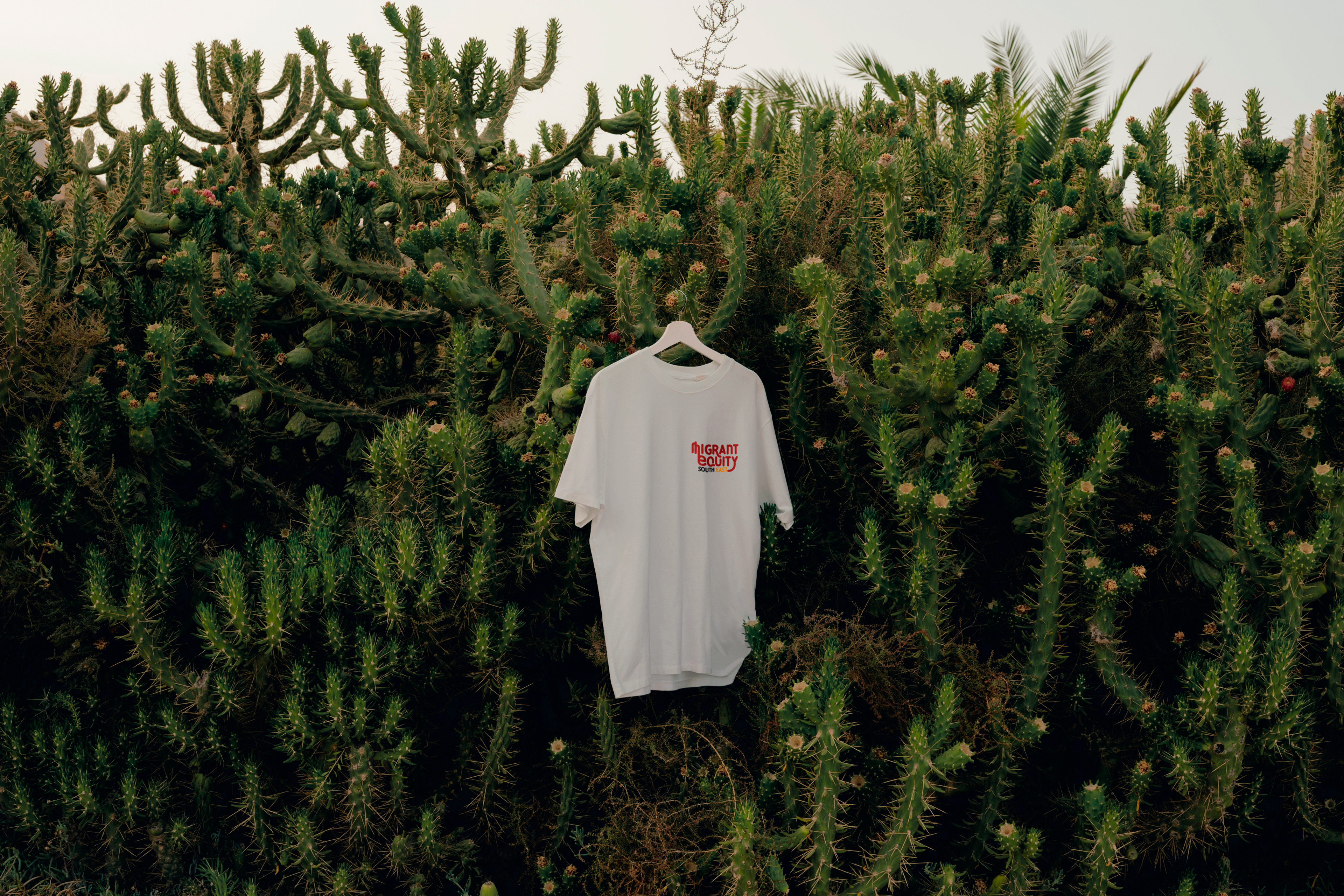
Since the primary way that the audience interacts with the brand is through illustrated posters made by a revolving door of local artists, we also wanted to tighten the style guide to suit the new logo: we wanted to give people freedom to put their own mark on illustrations, but also have a common link that anybody would easily recognise. We chose not to limit things like texture and decorative elements of illustration, but have a general guide so that a range of artists could easily work within it.
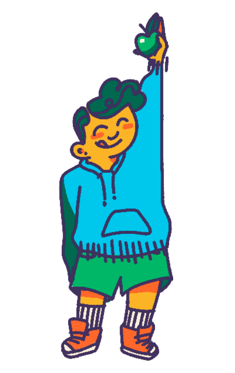
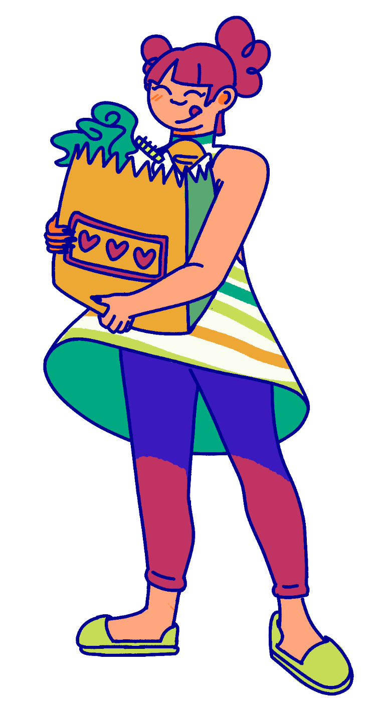

Here's a sample poster made using the new style guide, for digital use.

