ROLE: DESIGNER, ANIMATOR
I was a part of the team expanding on the brand language of The Plated Project, a company taking on the issue of food insecurity in India through the power of art.
The first part of this was to illustrate the three pillars of the brand, which feature heavily on the website and in packaging. I experimented a bit with style after an initial round of shortlisting symbols. The goal was to be individual and artistic but not too unapproachable for the average consumer.



The three brand pillars of rare, exquisite and impactful embody the mission of The Plated Project, a company that aims to bridge Indian art with a good cause. Started during the COVID-19 pandemic with the simple message of "buy a plate, fill a plate", the company aims to bring unique artists to the attention of the Indian consumer, while using profits to benefit those of us who need it most.
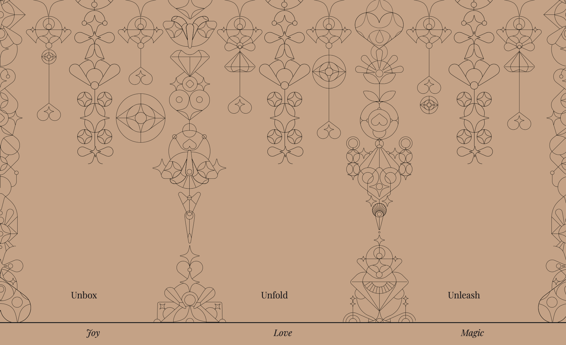
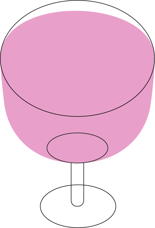
Along with the brand pillars, I created a bank of small, geometric spot illustrations for the brand. These are used everywhere from the website to communication and packaging: Although these illustrations are made so they are flexible and can be used without colour, as importance should always be given to the art, there is a bright palette
We kept iterating on these icons for use on the website, and started to think of other places they could be used.



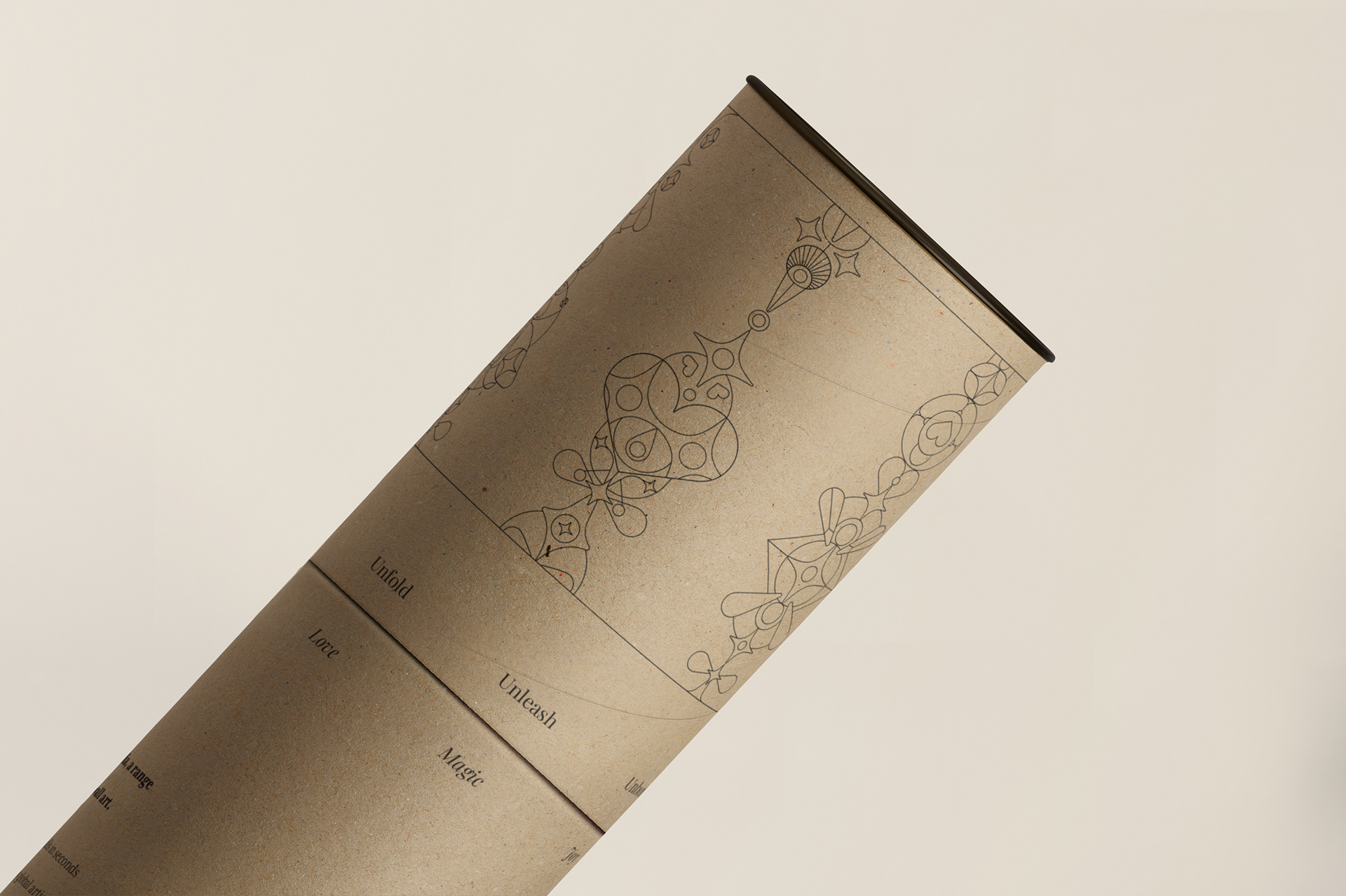
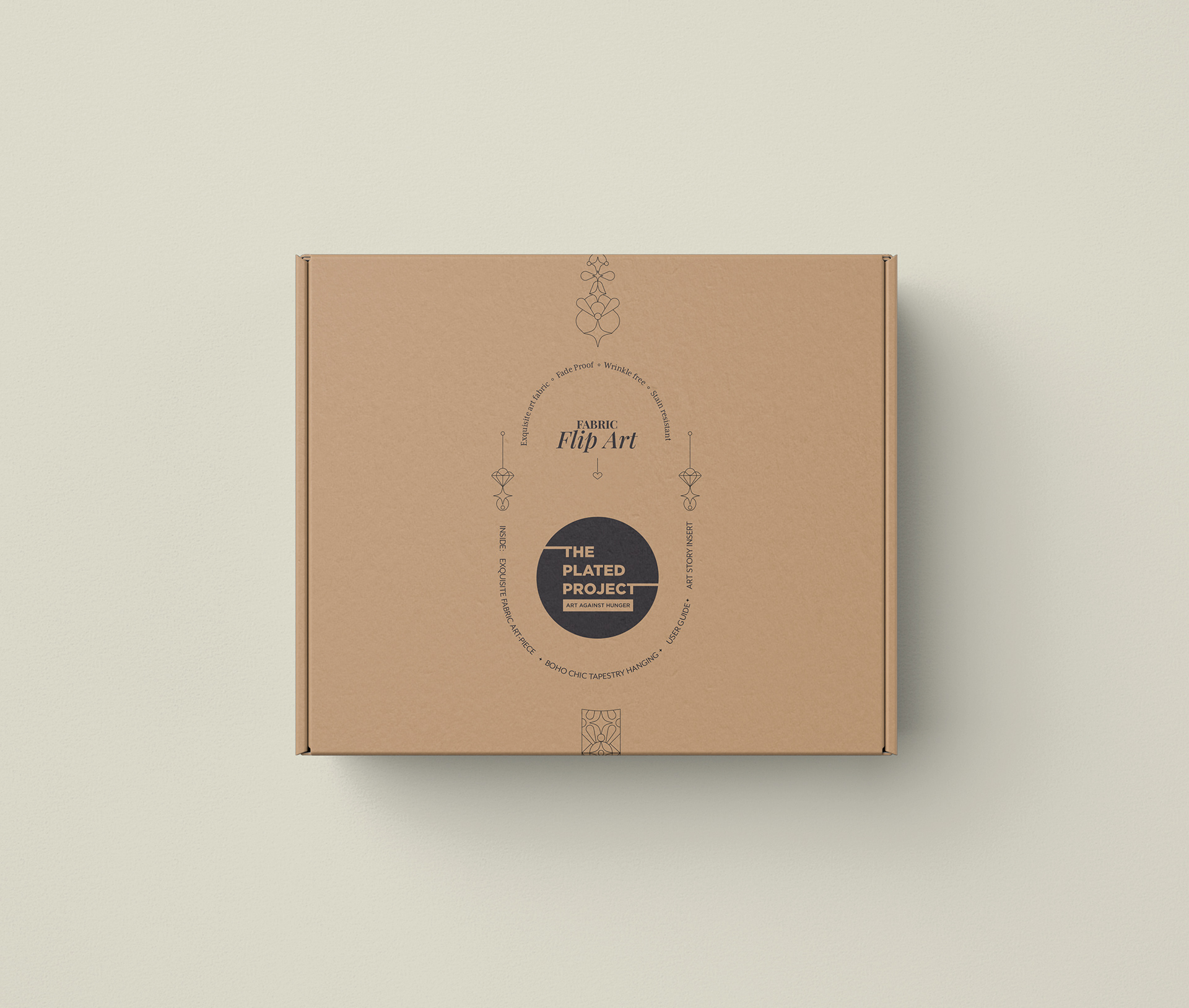
We considered how to bring these illustrations to packaging, and created designs for a new launch of fabric wall art: we simplified the palette to only be black symbols. The illustrations were combined to make them more abstract for outer packaging, and into patterns for items like butter paper, turning the brand language into art as well.
